

A luxury hotel brand born from the river that built the city.
Every great European city was shaped by its river. But most hotel brands don't care about that. They care about marble lobbies, gold accents, and looking like every other luxury hotel in every other city.
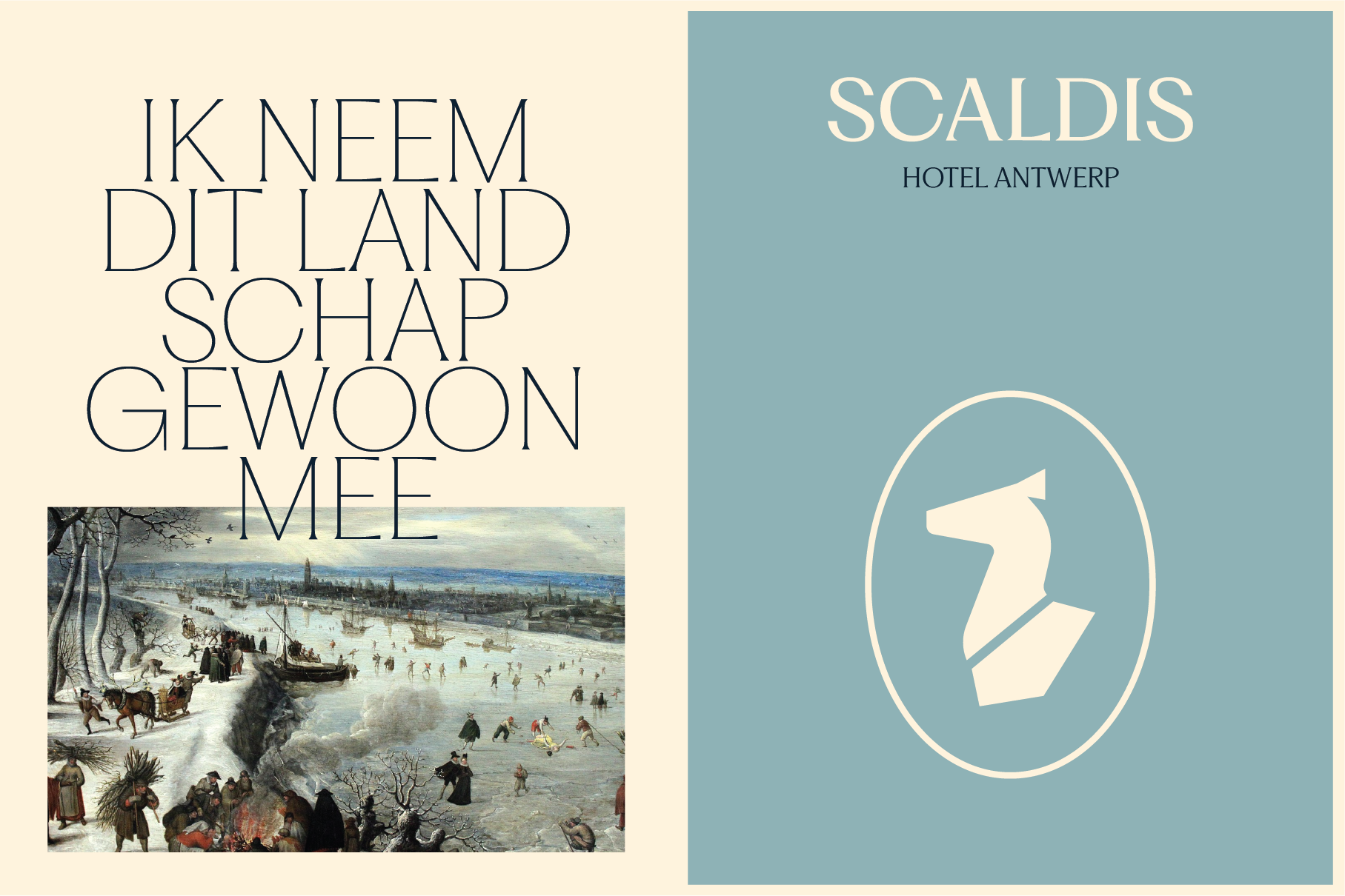
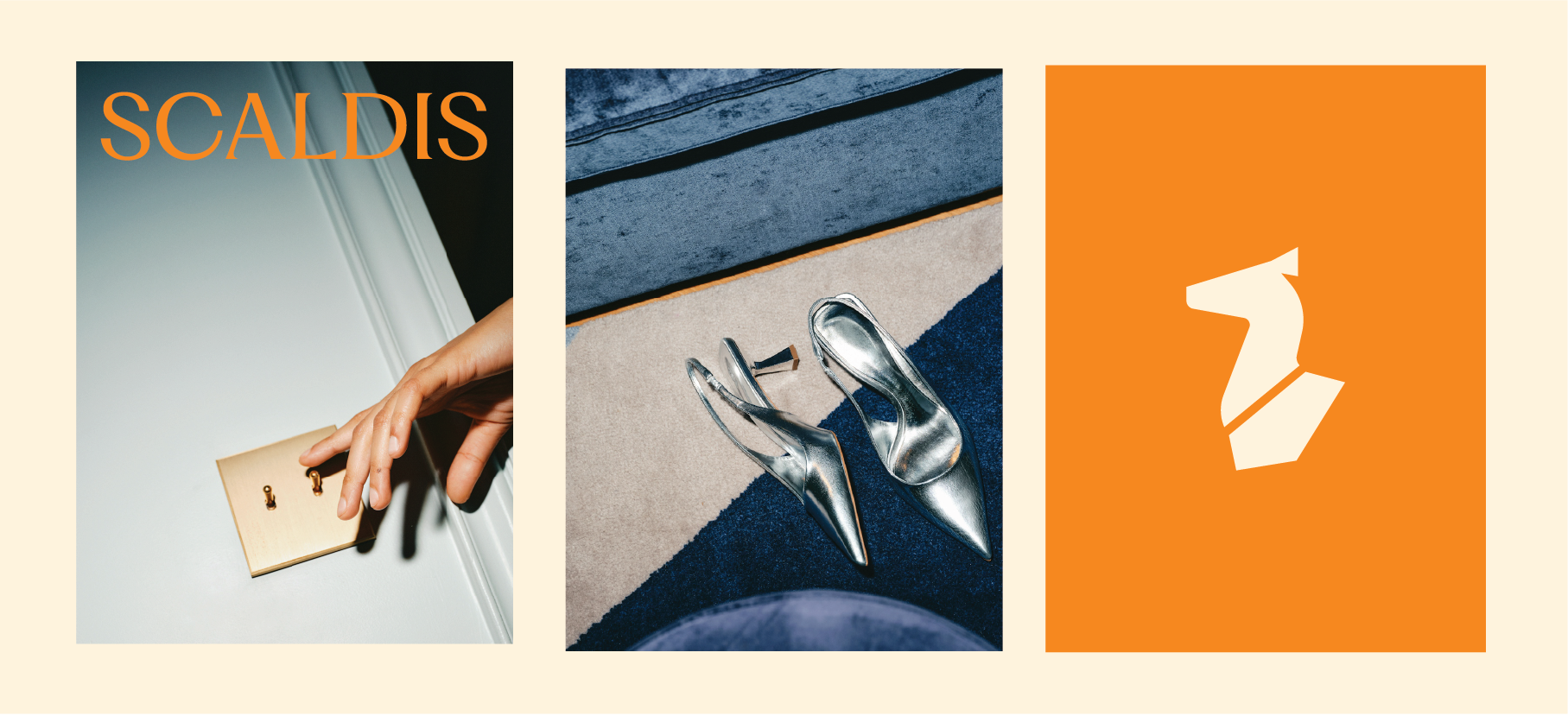
Scaldis is a boutique hotel concept that starts in Antwerp, on the banks of the Schelde. The idea was to create a hospitality brand that actually feels like the city it's in. Not generic luxury with a local postcard in the lobby, but a brand rooted in the mythology, culture, and history of the river itself. Warm, cultural, modern, and designed to expand to other river cities around the world.
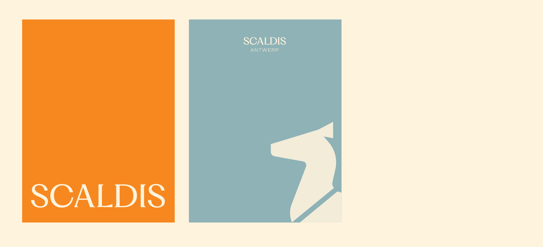
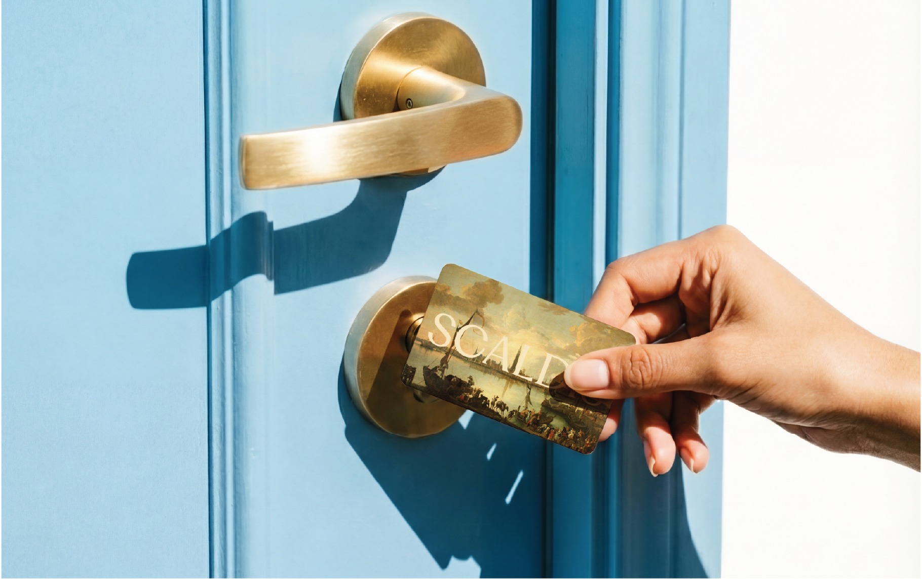
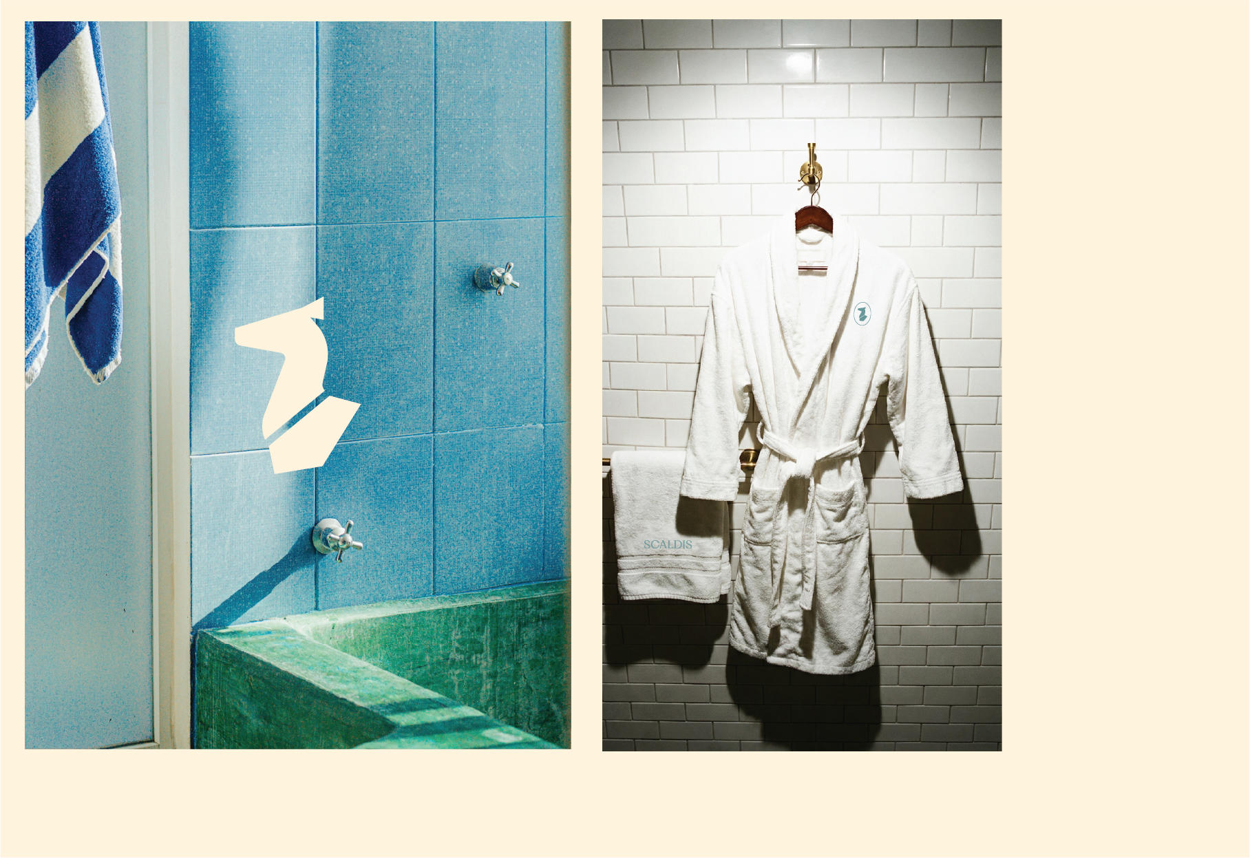
BRAND IDENTITY HOTEL
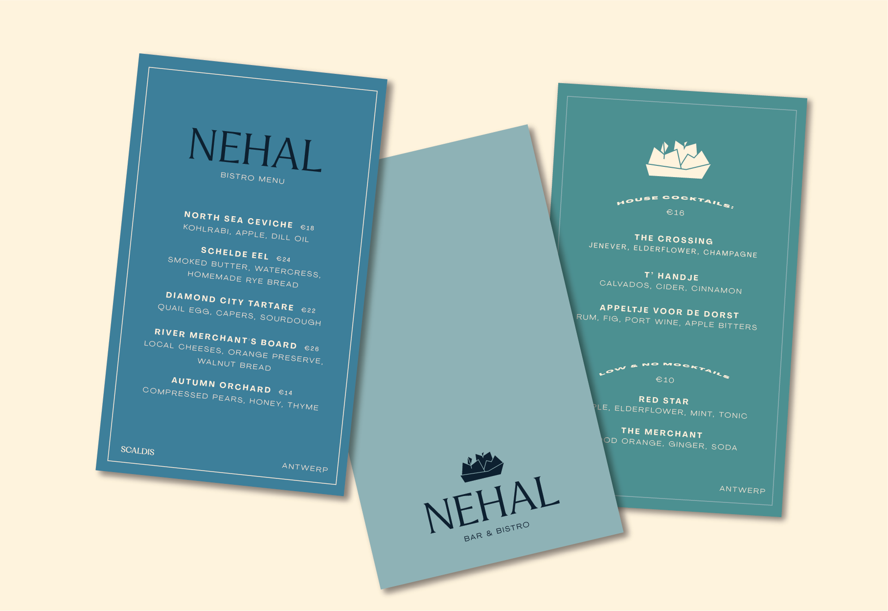
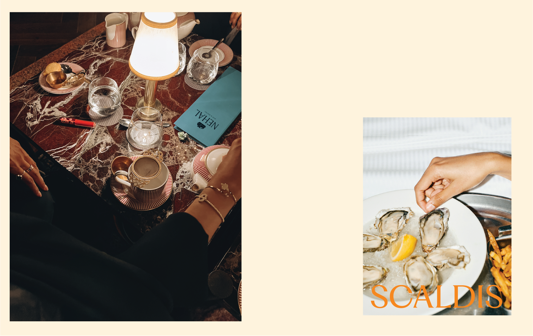
BRAND IDENTITY RESTAURANT
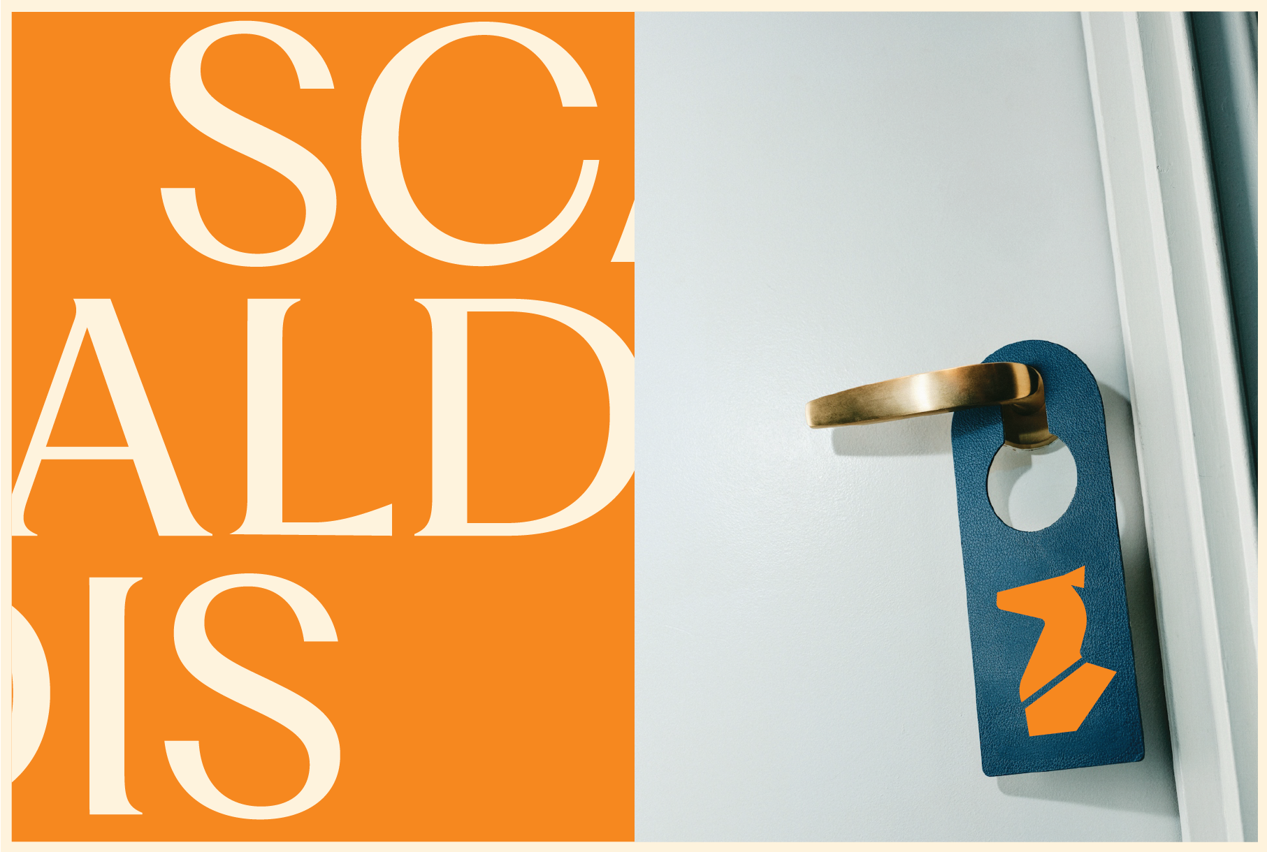
DIGITAL & PRINT COLLATERAL
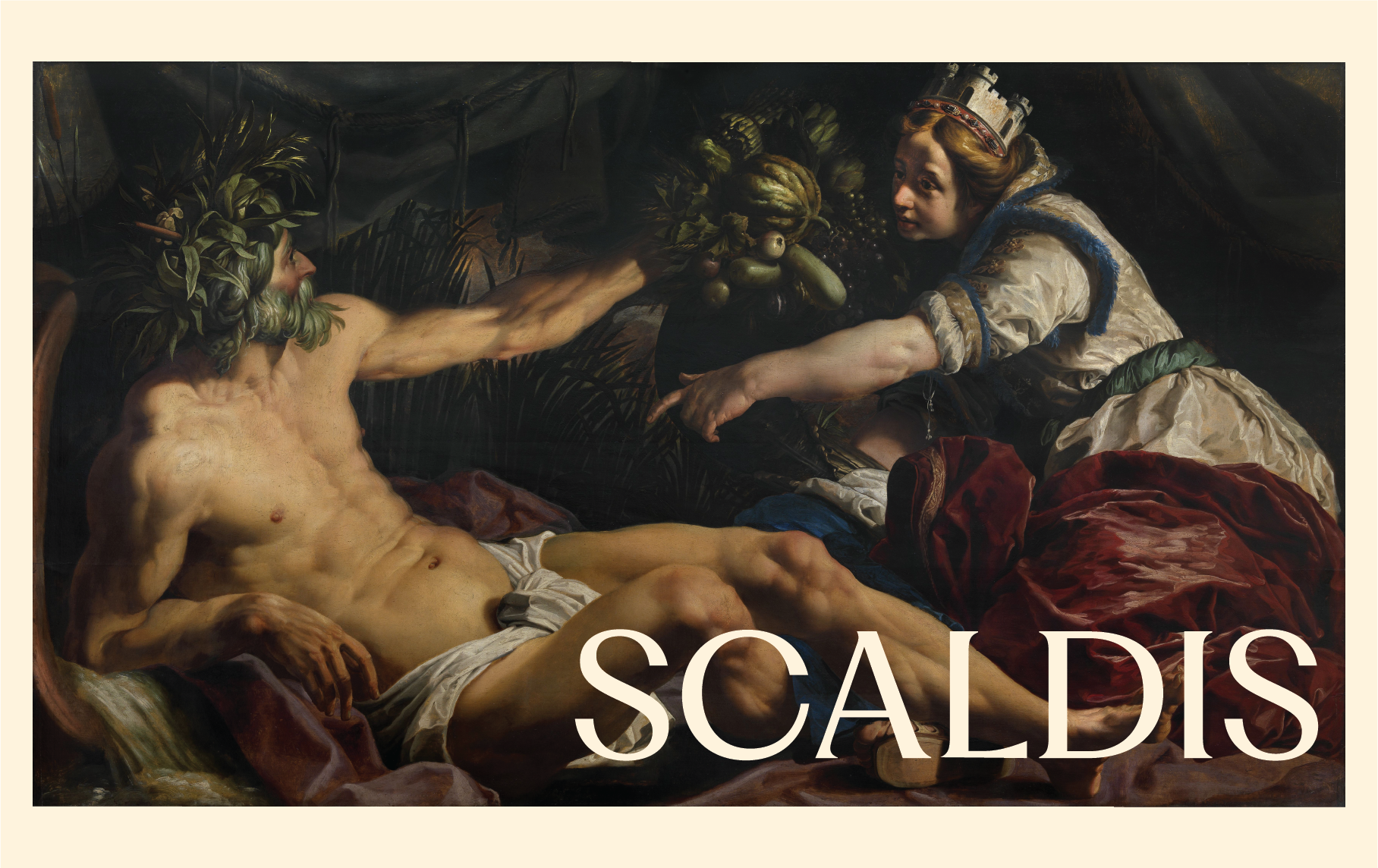
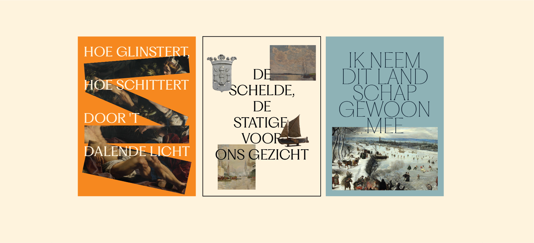
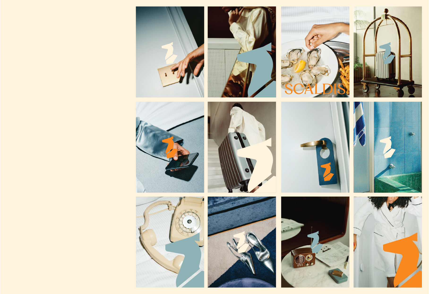
The name comes from the Latin word for the Schelde. The brand draws on the mythology of Nehalennia, the ancient goddess who protected travellers crossing the North Sea. Her symbols (ships, fruit, abundance) are woven into the visual identity without ever feeling like a history lesson.
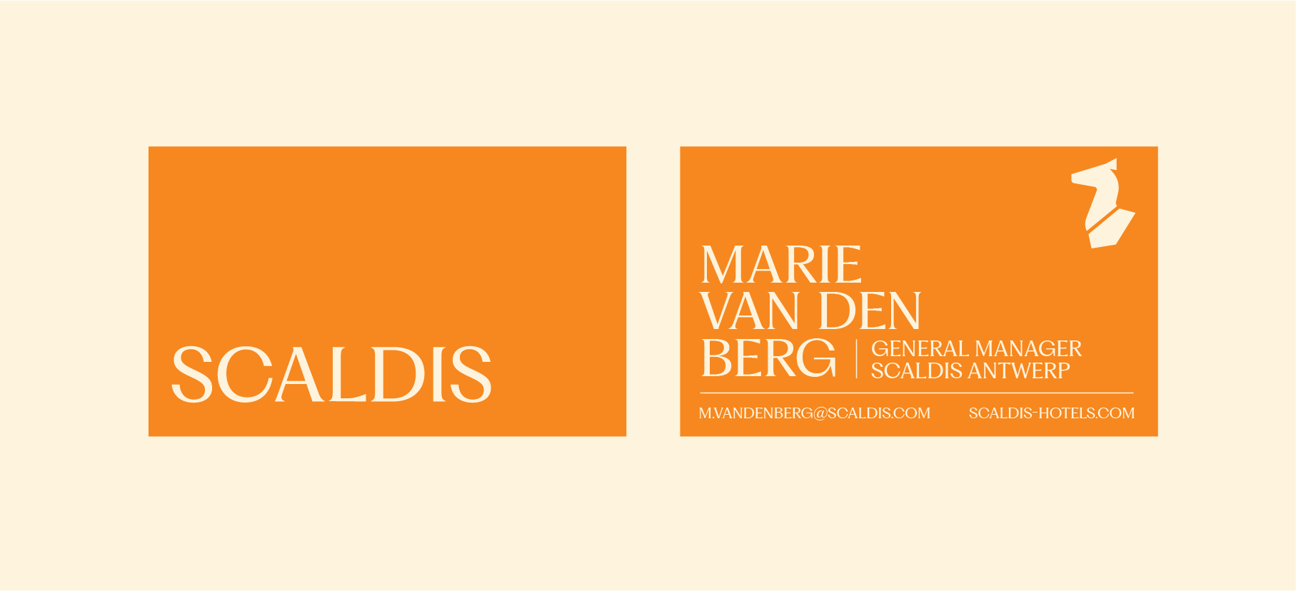
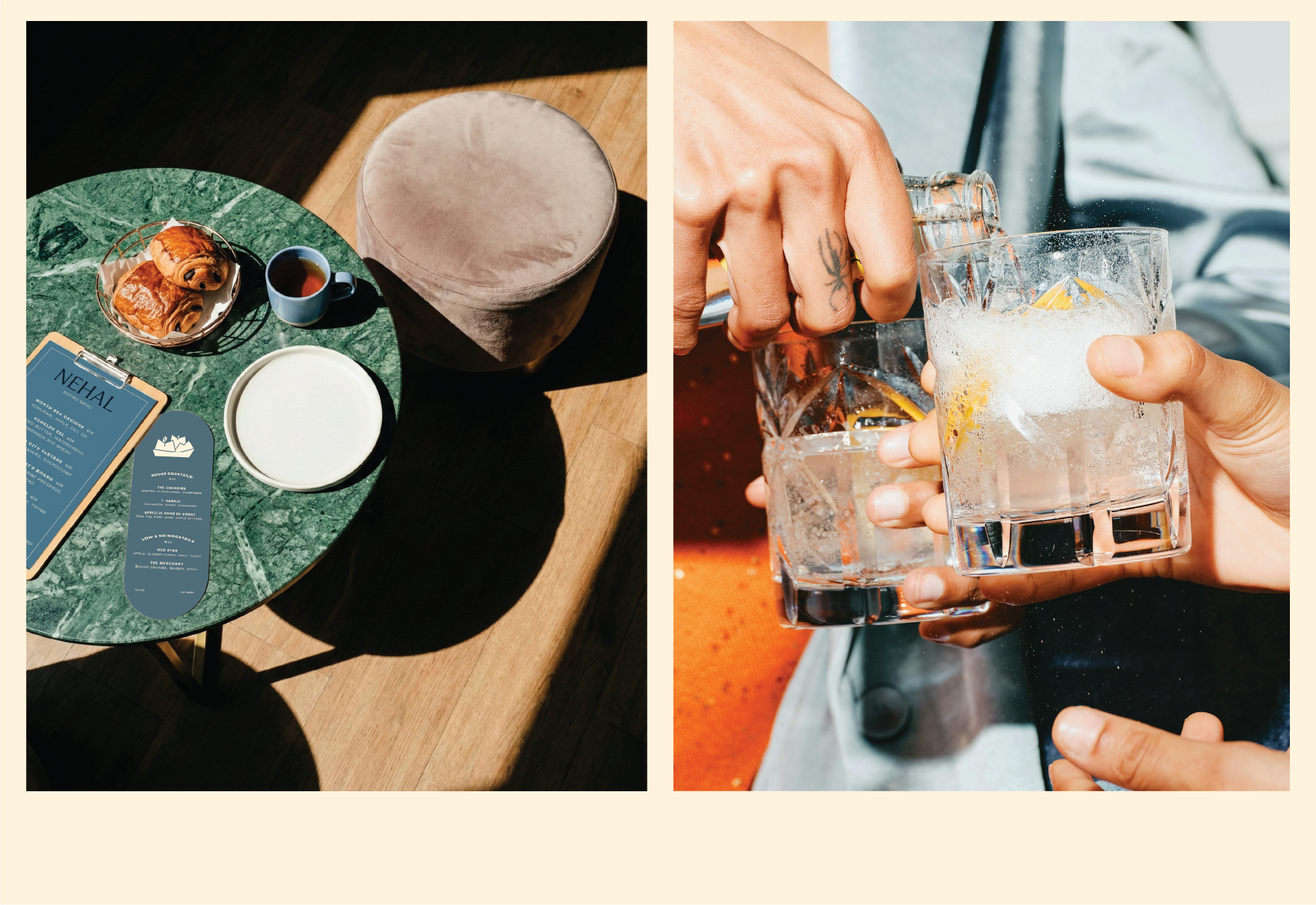
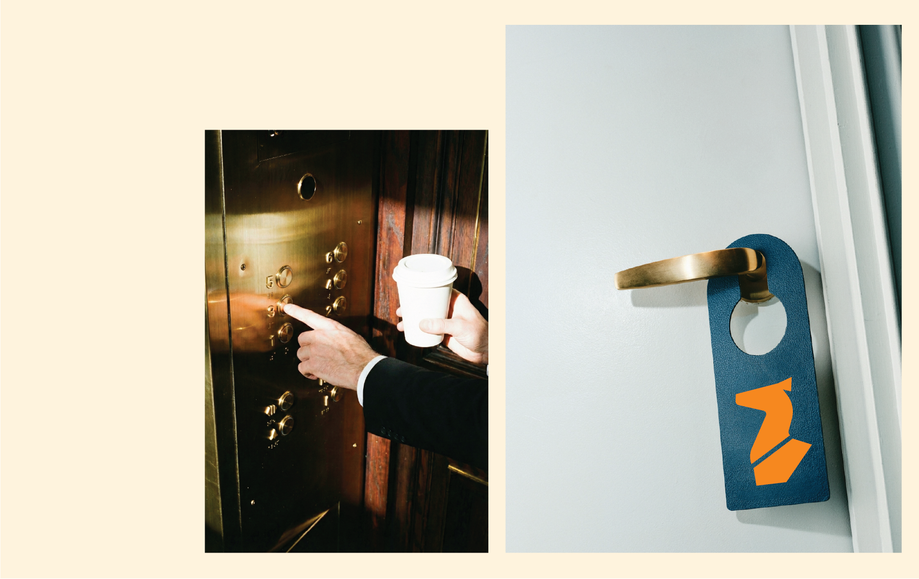
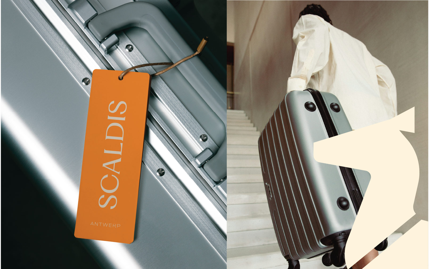
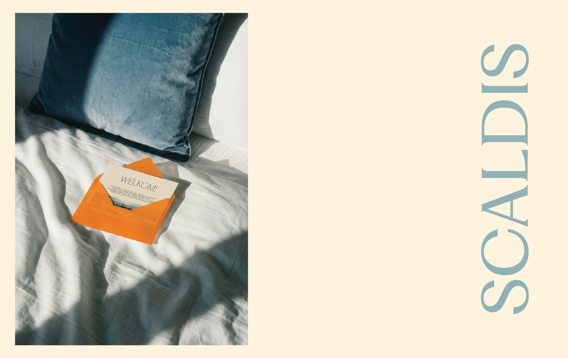
We designed everything from the logo and brand identity to restaurant menus, welcome cards, stationery, and guest touchpoints. The whole system was built to feel rooted in Antwerp first, but flexible enough to travel to the next river city without losing its soul.
A passion project to prove that luxury hospitality doesn't have to look the same in every city. The river changes. The brand should too.
PROJECT: SCALDIS
TYPE: CONCEPT / PASSION PROJECT
SCOPE: BRAND STRATEGY, BRAND IDENTITY, ART DIRECTION, MARKETING MATERIALS, PRINT COLLATERAL, GUEST EXPERIENCE DESIGN