
Sustainable candles that refuse to look the part.
Who says sustainability has to be boring? Because if you walk through the candle aisle right now, you'd think there was some unwritten rule that eco-friendly means beige, minimal, and a bit... safe.
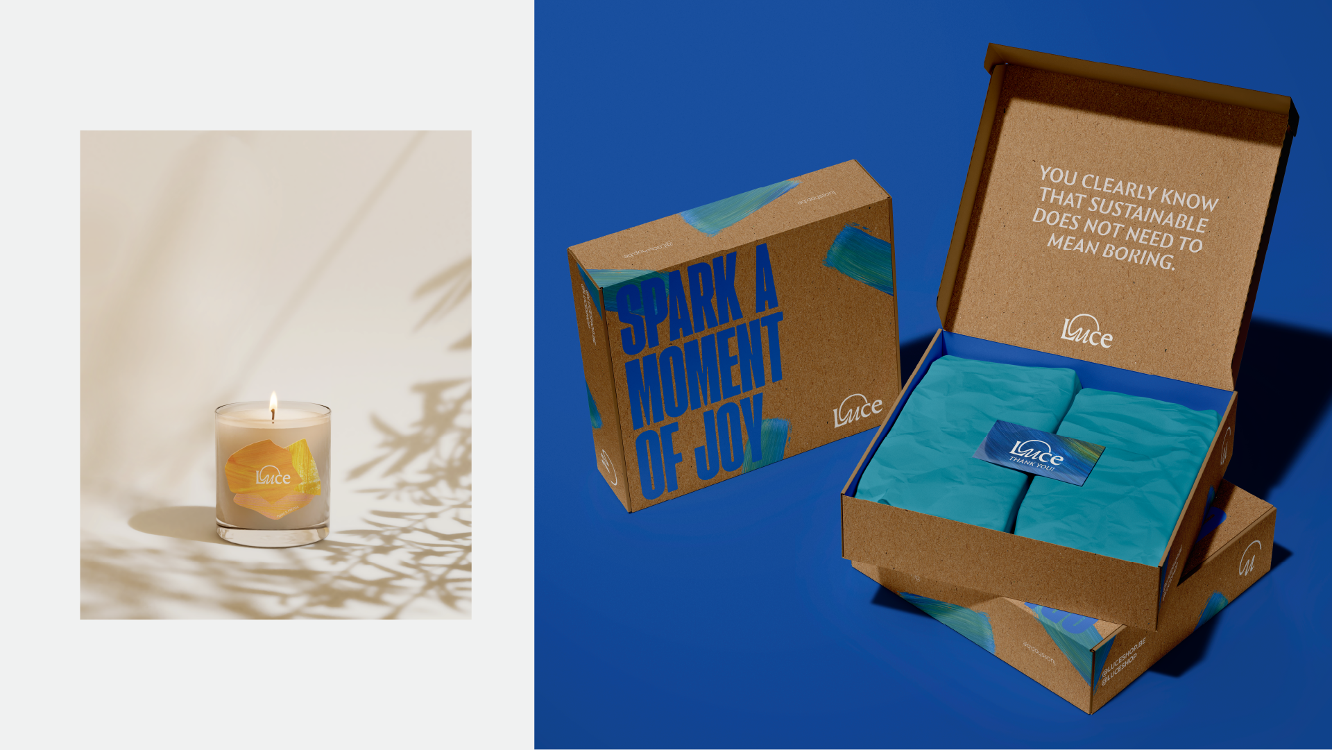
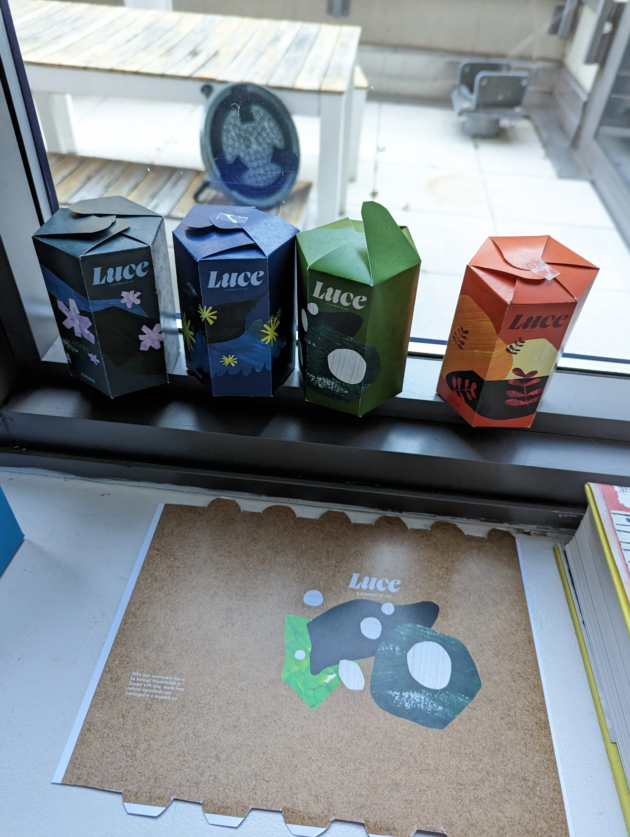
Luce is a Belgian candle brand where every candle is handcrafted with rapeseed oil, every ingredient is sourced in Europe, and everything is sustainable, recyclable and reusable. The product was already doing the hard work. The brand needed to catch up and prove that you can care about the planet and still look incredible on someone's shelf.
BRAND STRATEGY
BRAND IDENTITY
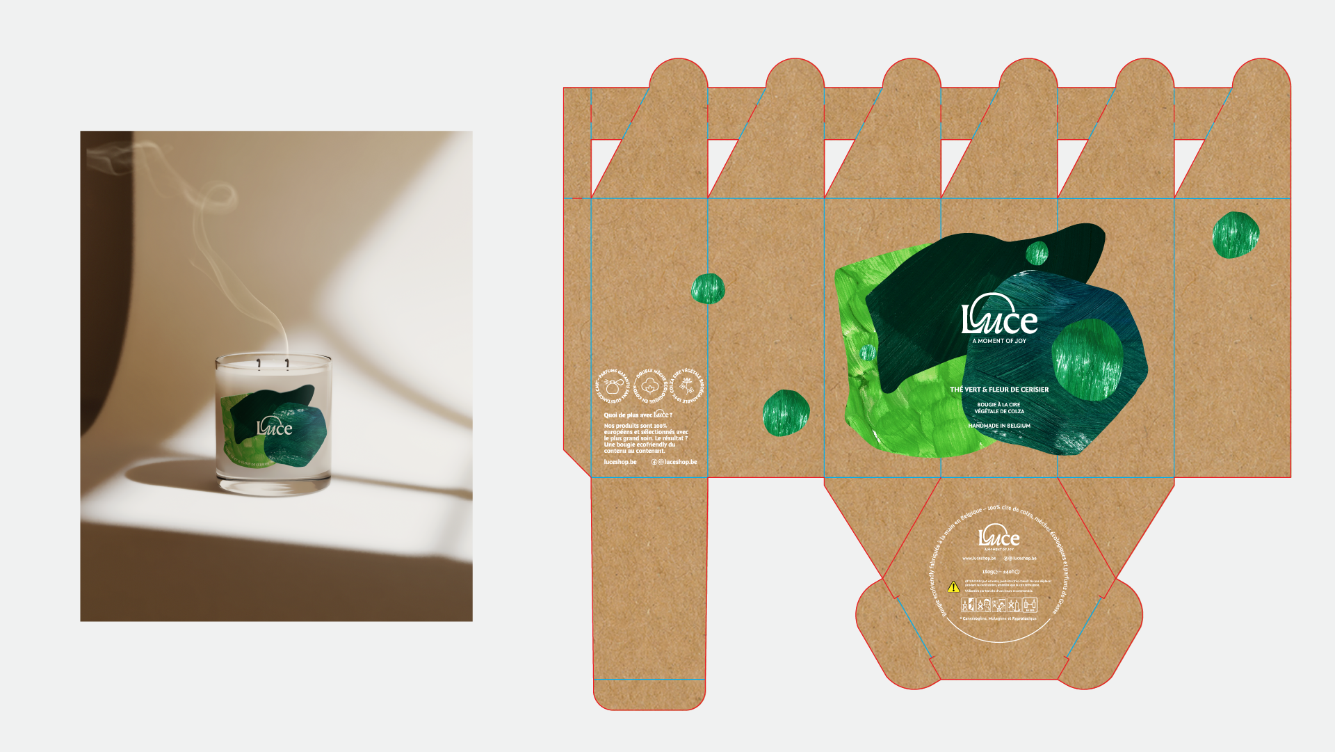
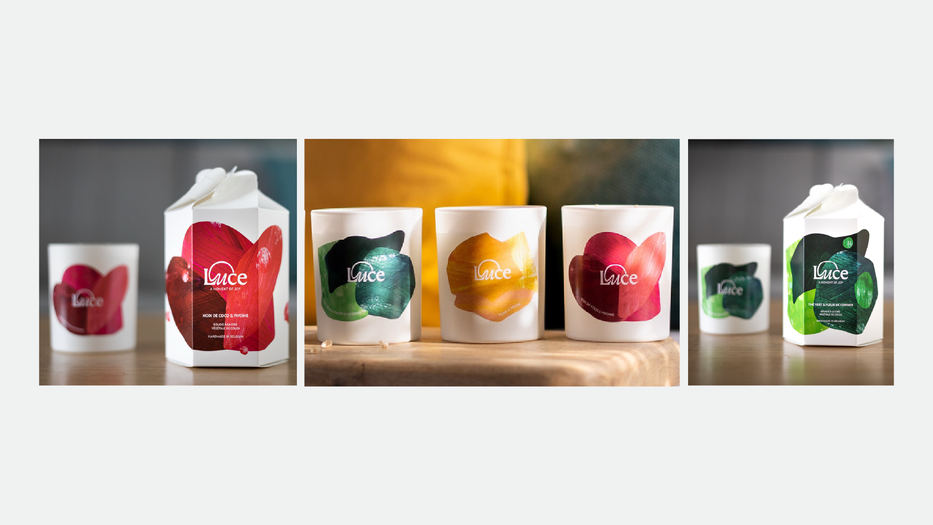
PACKAGING
DIGITAL & PRINT COLLATERAL
PRINTER LIAISON
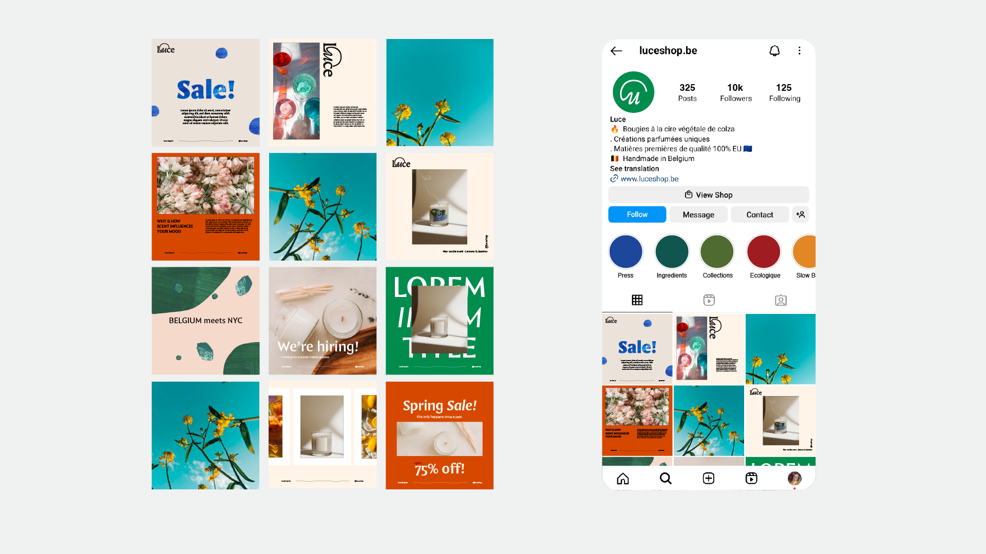
SOCIAL MEDIA
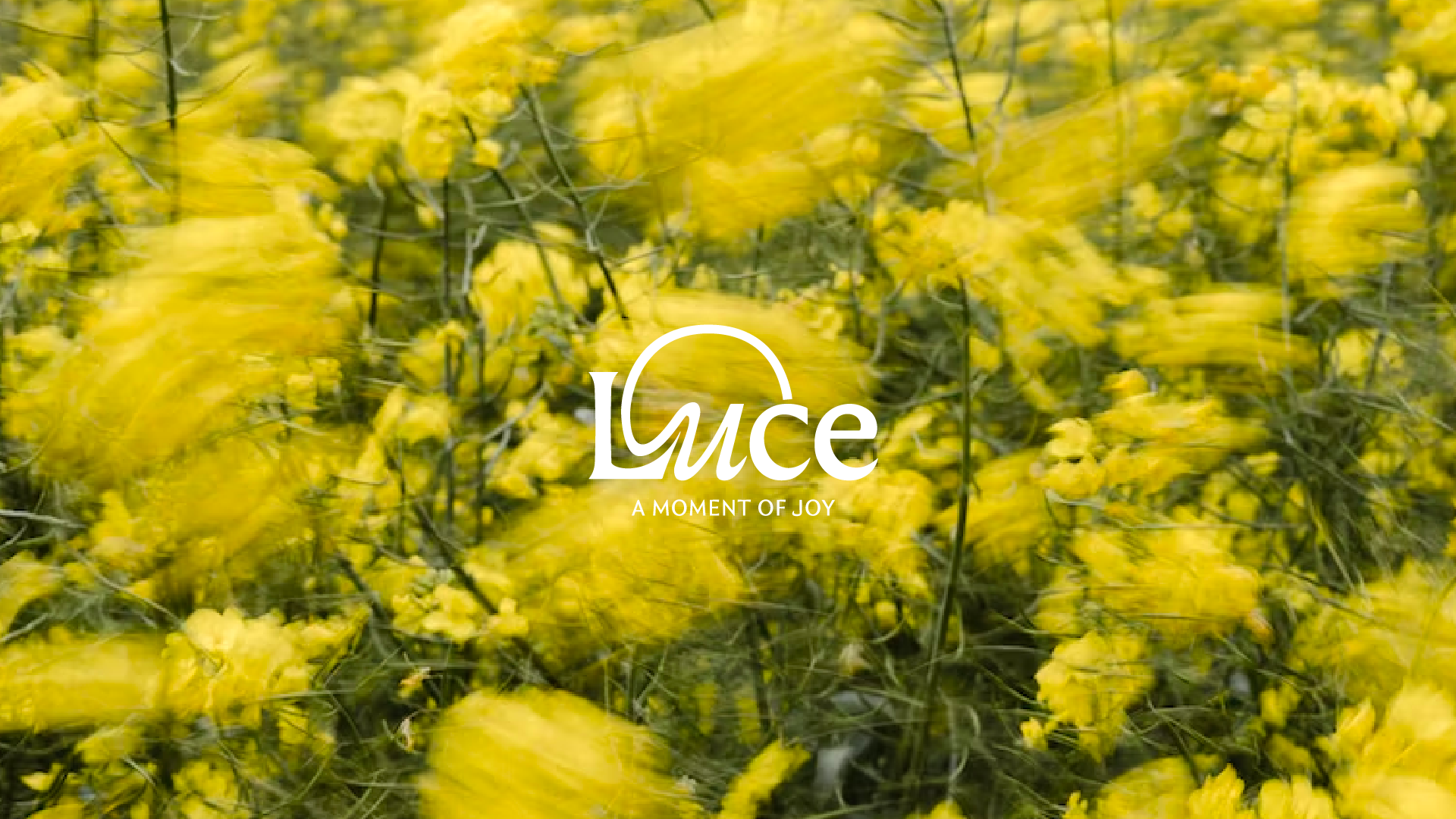
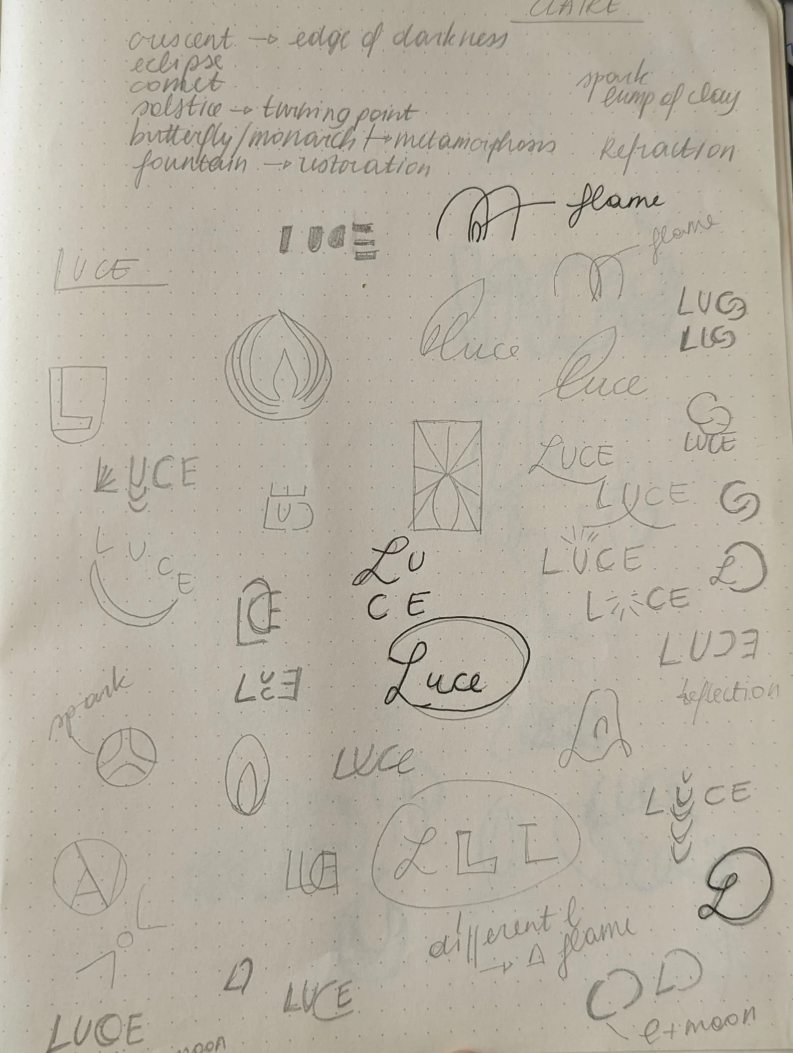
A brand that feels like a glow
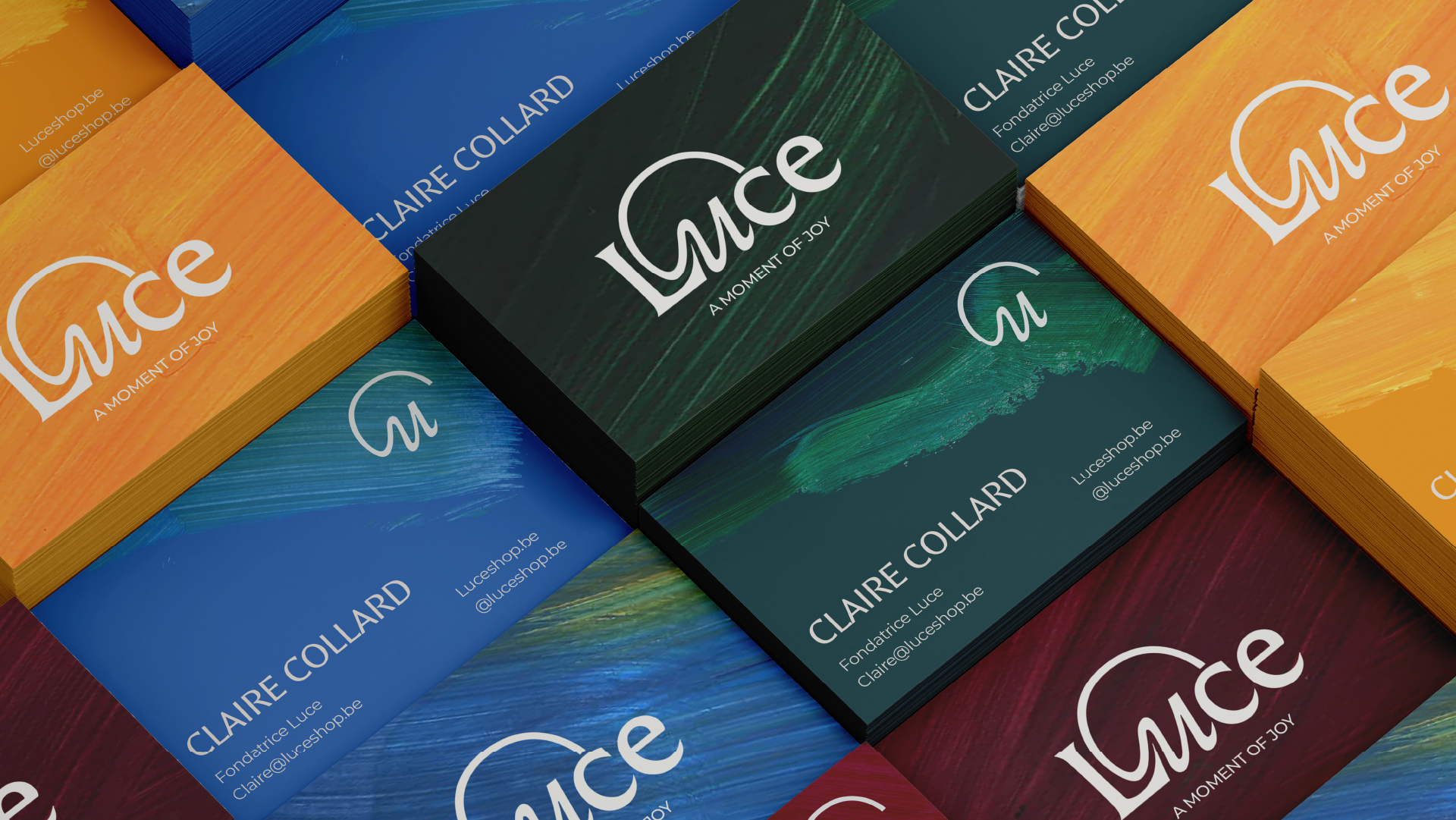
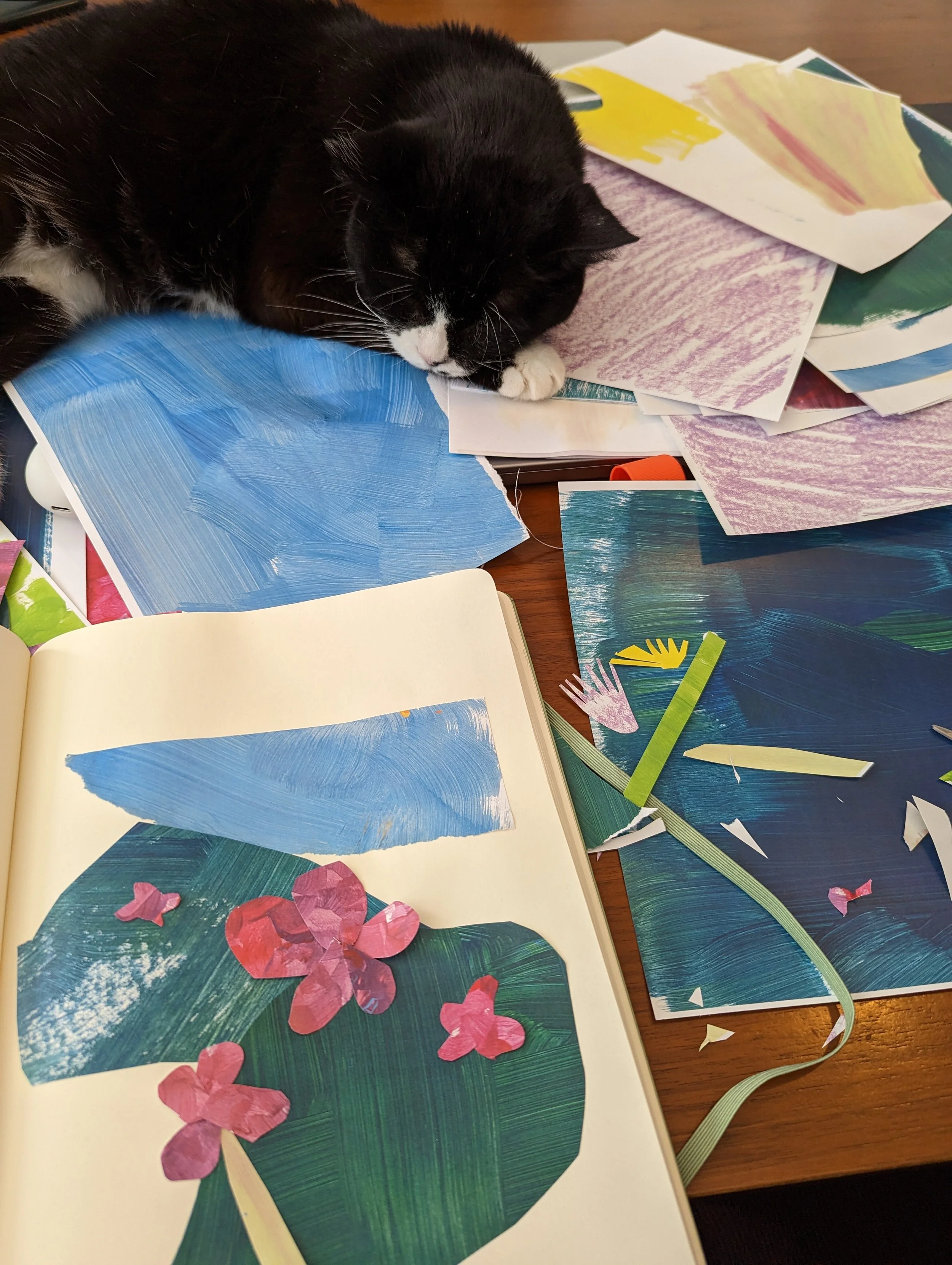
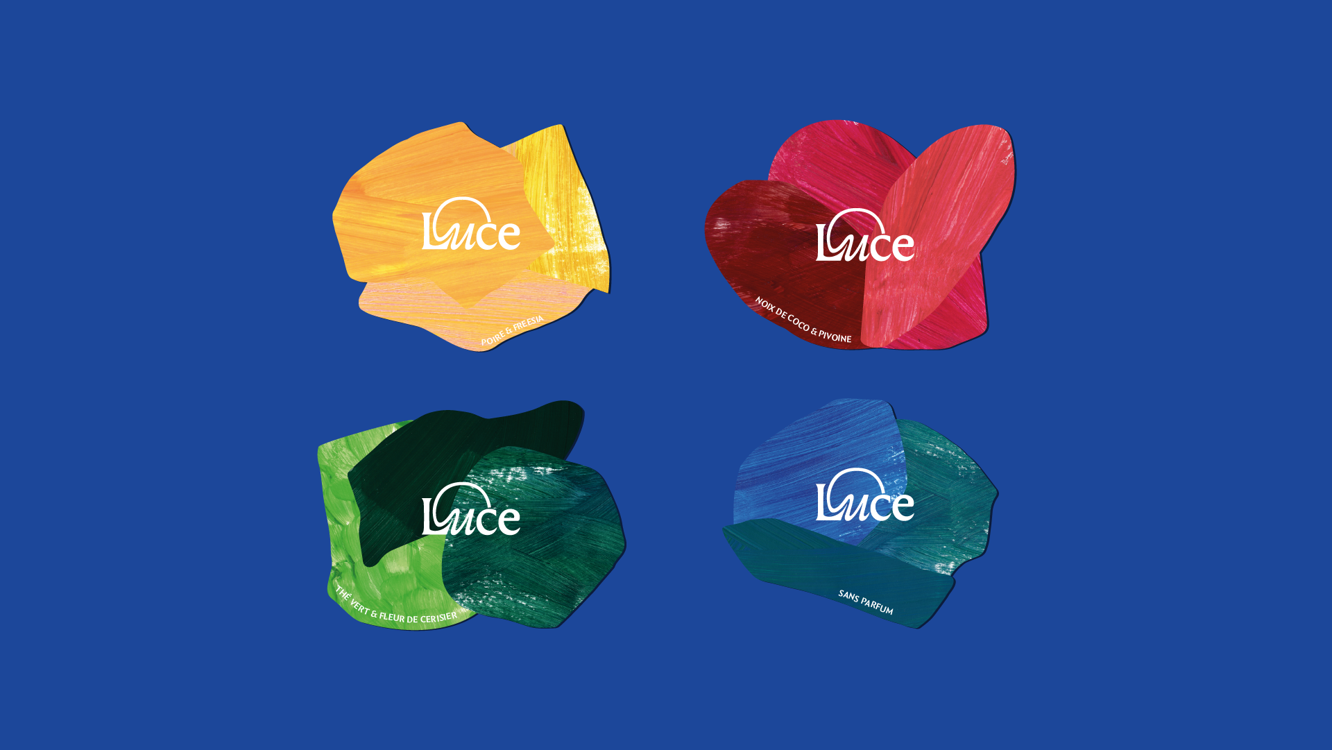
We wanted the brand to feel like the experience of lighting one of their candles. Warm, vibrant, full of life. So instead of defaulting to digital patterns like everyone else, we hand-painted over 70 sheets of paper. Layered paint, crayon, mixed media. Tested textures until we found something that felt as handcrafted as the candles themselves. Each piece was then digitised at high resolution, preserving every brushstroke and turning them into shapes we could use across the packaging.
The result is a brand that's built to grow with Luce into seasonal collections, home goods, and whatever comes next.
70 sheets of hand-painted paper, one brand that finally matches the product inside it.
CLIENT: LUCE
LOCATION: BELGIUM
SCOPE: BRAND STRATEGY, BRAND IDENTITY, PACKAGING, DIGITAL & PRINT COLLATERAL, PRINTER LIAISON, SOCIAL MEDIA