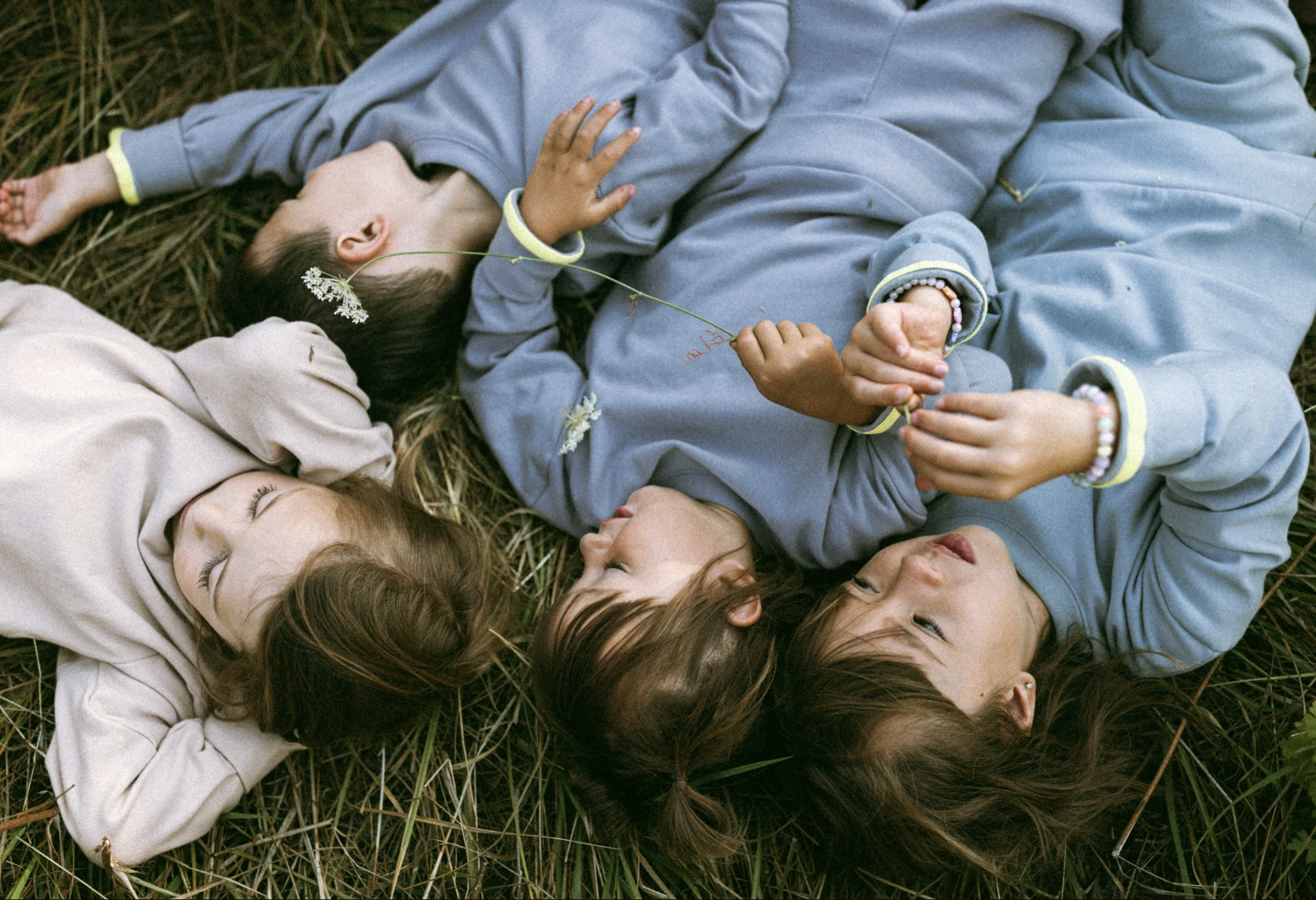

Bringing Joy, Comfort & Impact to Sustainable Kids’ Fashion
Lemonade Cake isn’t just a children’s clothing brand. It’s a movement.
Built on the belief that every child deserves comfort and joy, the brand donates proceeds to organizations dedicated to ending child trafficking. More than just making an impact, Lemonade Cake wanted to create a brand that felt uplifting, warm, and inviting—a brand that parents would connect with while still feeling playful and light.
The challenge? Striking that balance.
Playful, Not Childish
Most kids' clothing brands fall into the same trap: branding that speaks to children rather than the parents making the purchase.
Lemonade Cake needed an identity that felt playful but not childish, something that would stand out in a space dominated by ultra-minimal sustainable brands or overly cutesy, cartoonish aesthetics. It also needed to carry its mission gracefully, weaving its purpose into the design without feeling heavy or sombre. The brand had to feel hopeful, light, and warm in messaging and every visual touchpoint.
BRAND STRATEGY
BRAND IDENTITY
PACKAGING DESIGN
ART DIRECTION
COLLATERAL DESIGN

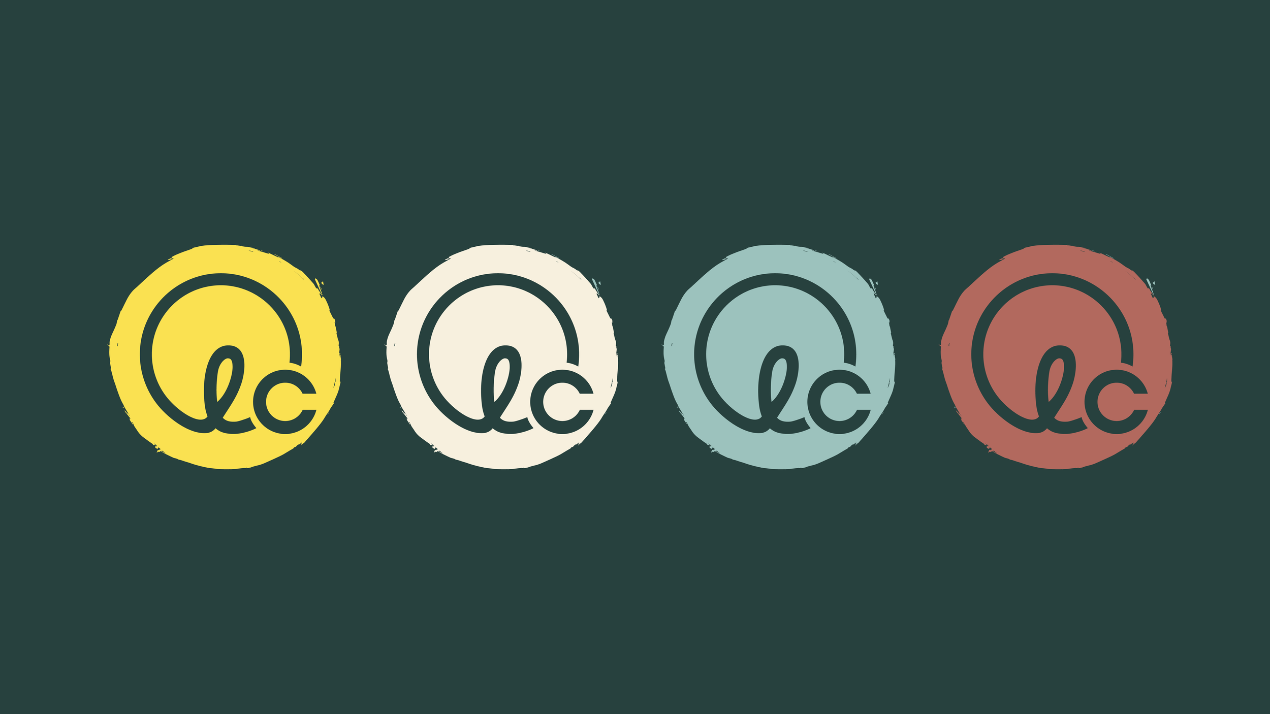
The Strategy: Building a Brand That Feels Like a Warm Embrace
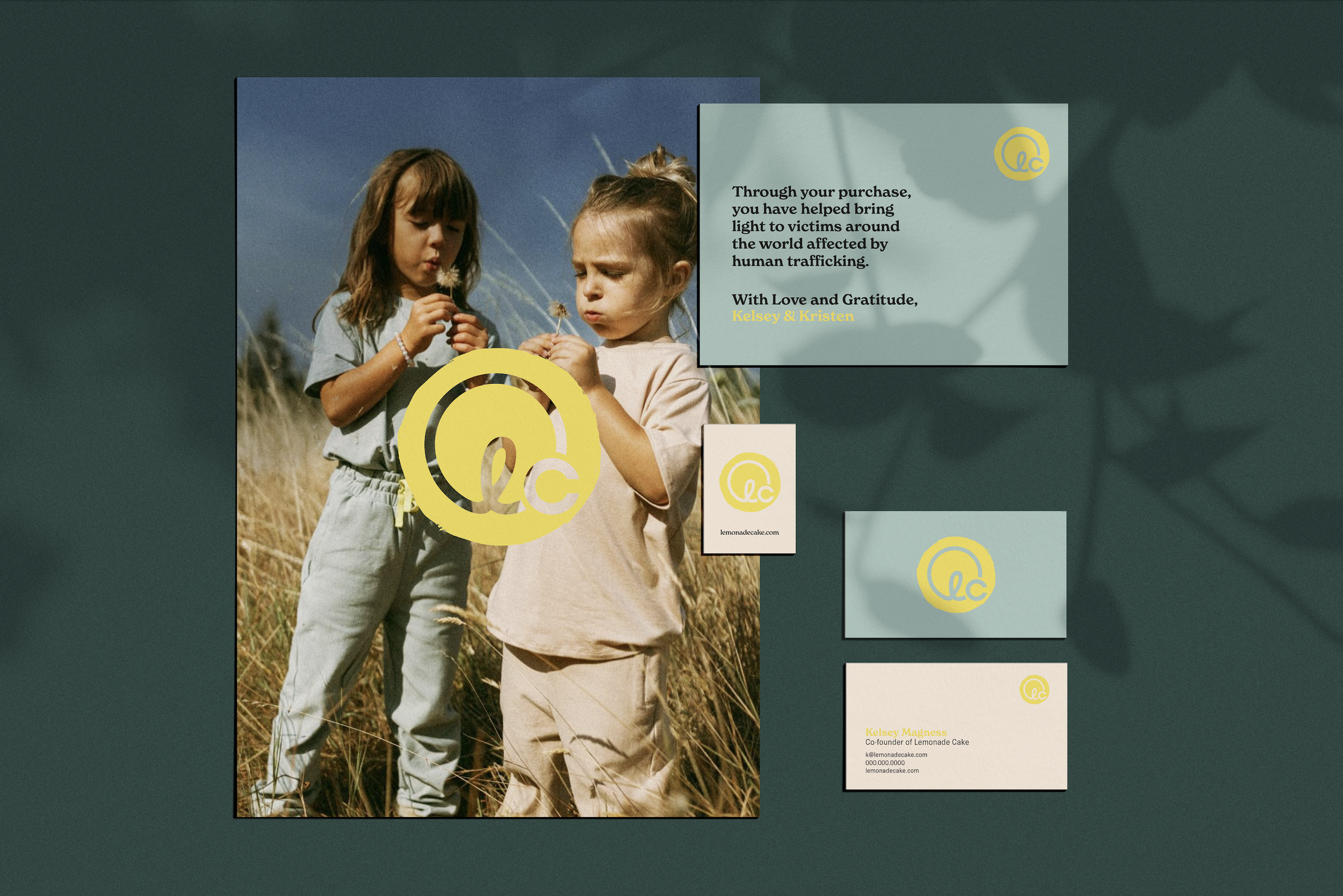
We leaned into a core brand element that symbolizes comfort, optimism, and light — the sun.
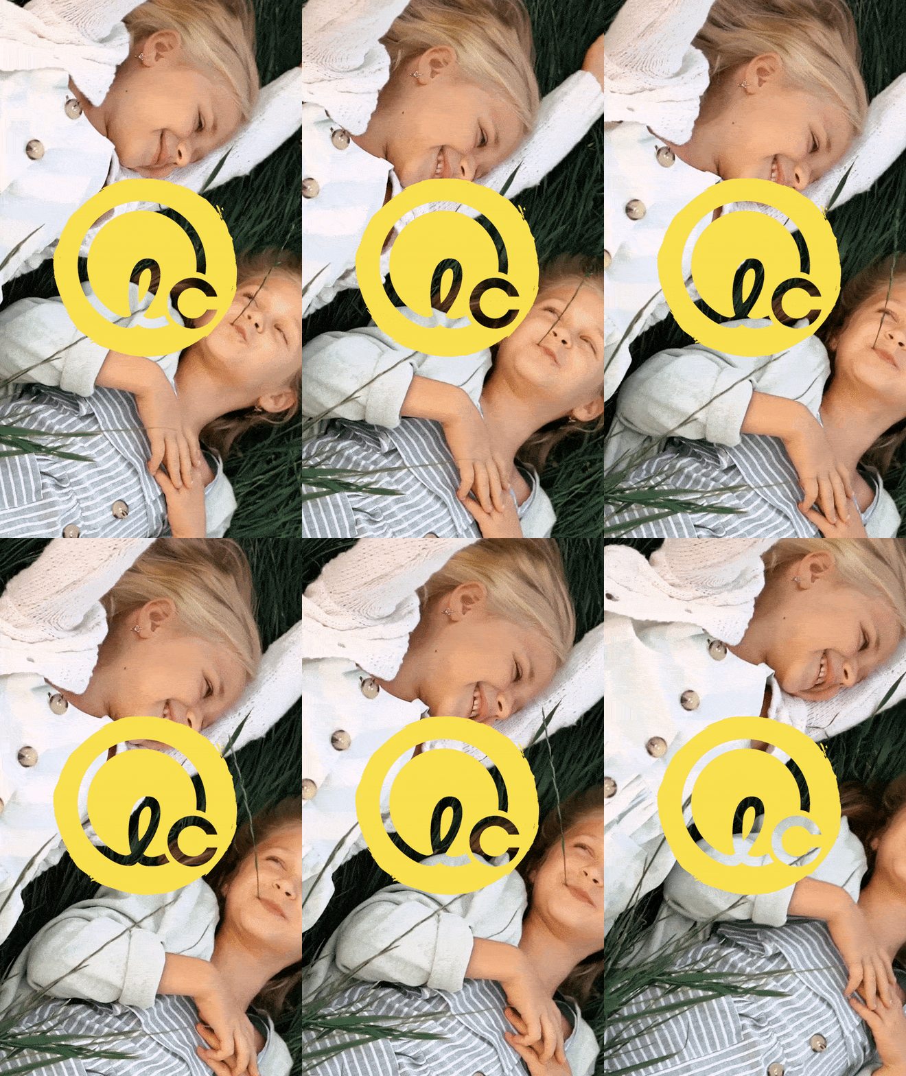
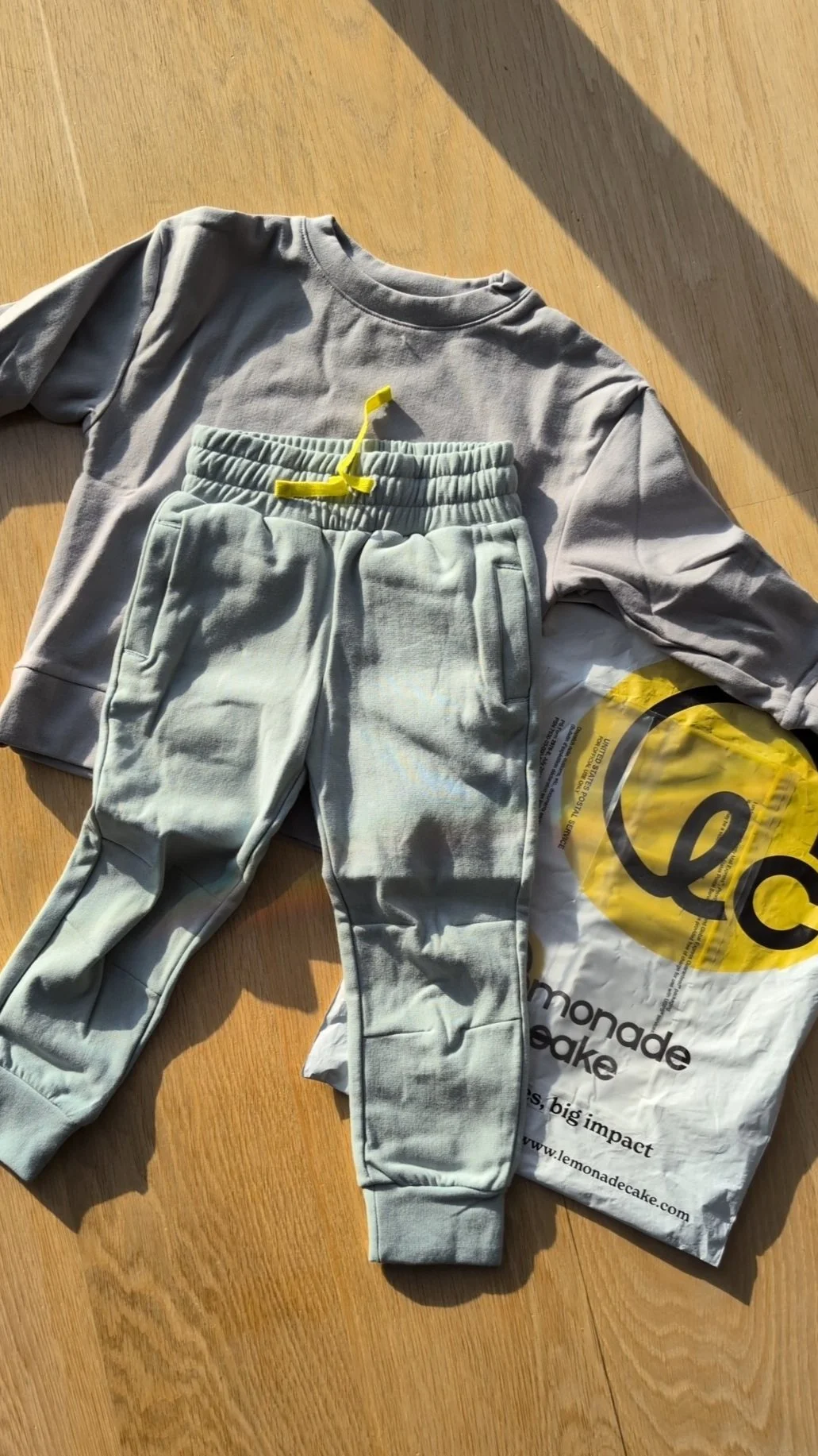
The primary yellow is more than just an accent. It became an ownable brand color, running through the visual identity and even into the clothing itself. This seamless connection between branding and product makes Lemonade Cake instantly recognizable, no matter where it appears.
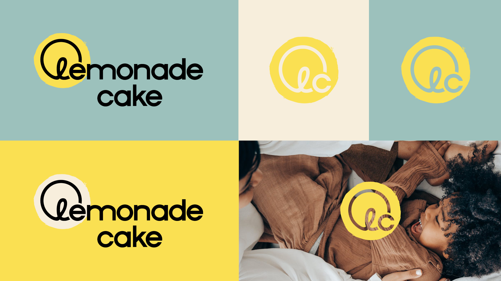
We crafted a custom wordmark and logomark for the logo that feels warm, organic, and inviting. The imperfectly round sun in the mark radiates a soft, friendly glow — like the first sunlight after a long night. The typography balances playfulness with authenticity, ensuring the brand stays approachable while feeling high-quality.
The result? A brand that parents trust, kids love, and nonprofit partners proudly stand behind.


A Brand That Grows With Its Mission
Lemonade Cake’s brand system was built for flexibility.
From packaging to clothing tags, website design, and digital content, the branding translates effortlessly across all platforms. The bold, warm color palette brings joy and vibrancy, while the typography keeps the look modern and timeless.
The identity wasn’t just designed for launch — it was designed to grow. Whether expanding into retail partnerships, new product categories, or deeper nonprofit collaborations, Lemonade Cake now has an identity that scales alongside its mission.


A Brand That Feels Good & Does Good
Since launching, Lemonade Cake has:
Gone live with its e-commerce platform, shipping worldwide.
Partnered with Safe Horizons, a leading nonprofit supporting survivors of human trafficking and Child Rescue Colaition.
Gained strong customer traction, with parents resonating deeply with both the brand’s mission and high-quality clothing.
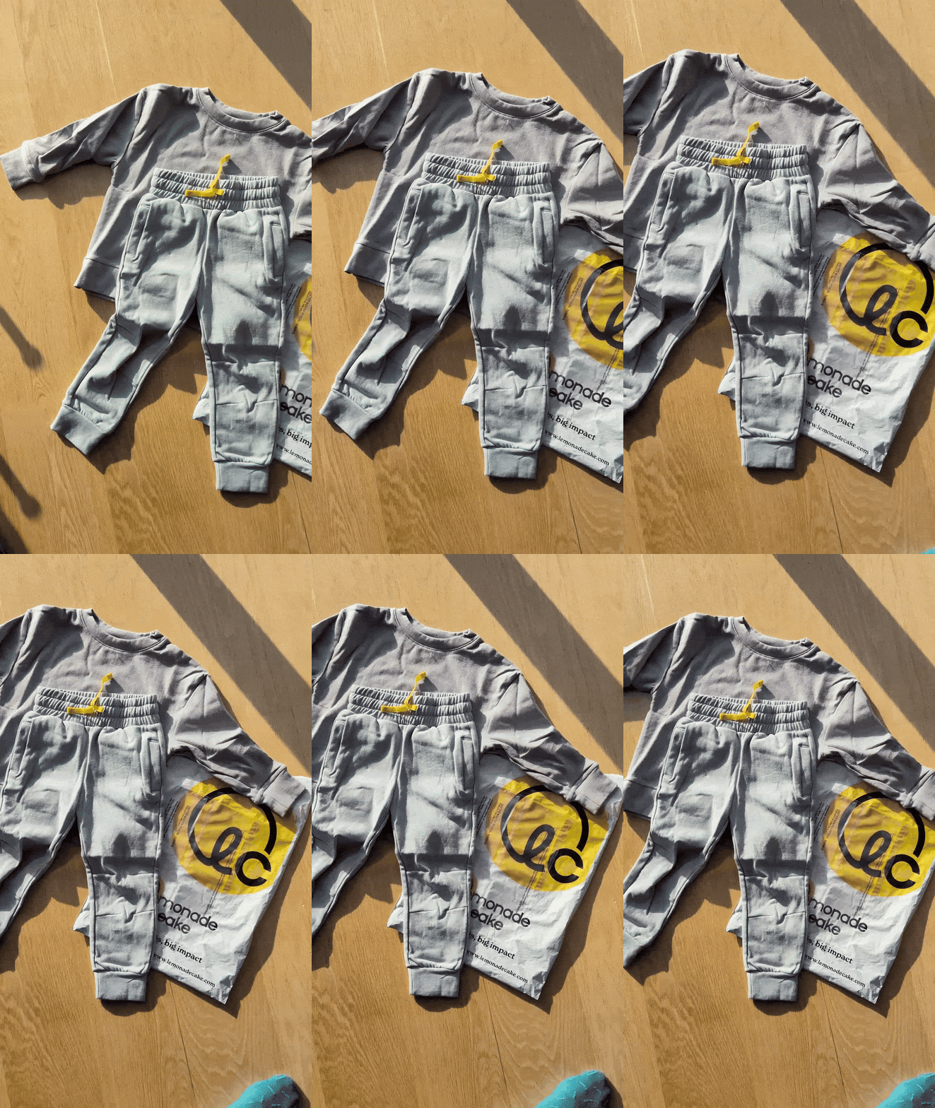
Integrated its core brand color yellow into its physical products, creating a seamless and instantly recognizable brand presence.
While still growing, the brand has already made an impact — not just in sales, but in how it’s reshaping the conversation around mission-driven fashion.


