

Where clinical meets luxury, without the cold shoulder.
The problem with medical spa branding? It's all starting to look the same. Black and white, greens, lotus flower or impersonal sans-serif wordmark. Pick one. Actually, pick all four. That's what most of them do. And the ones that try to go "luxury"? They end up feeling so exclusive they're almost uninviting.
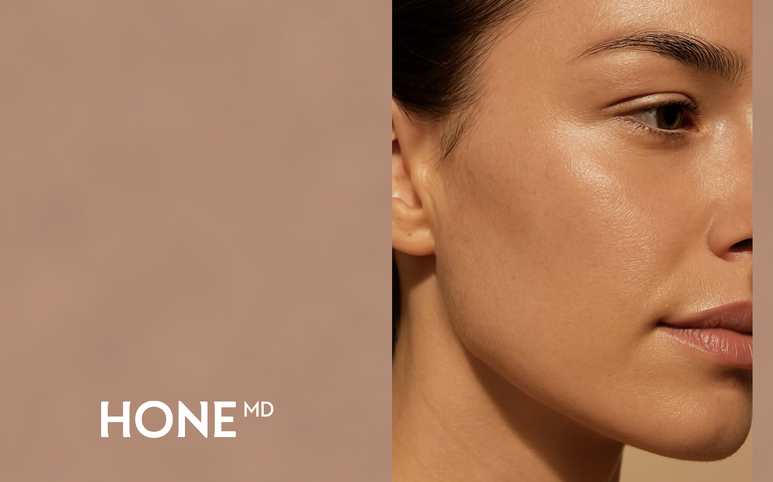
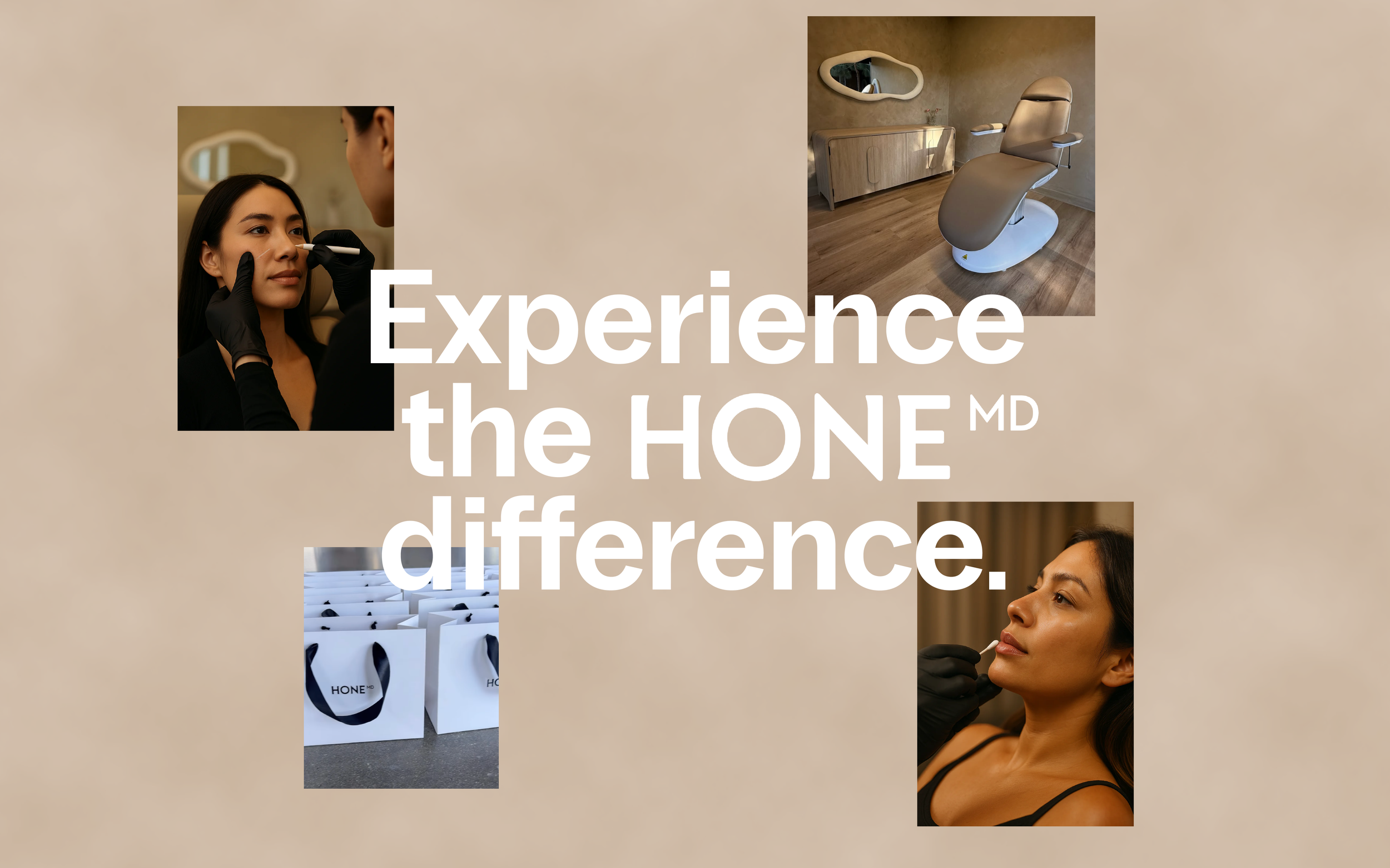
HoneMD wanted to grow in that space between clinical and luxury. The kind of brand that feels luxurious and trustworthy but still welcoming. Still attainable. The kind of place you'd actually want to walk into, not one that makes you feel like you need to whisper in the waiting room. That balance was the whole brief.
BRAND STRATEGY
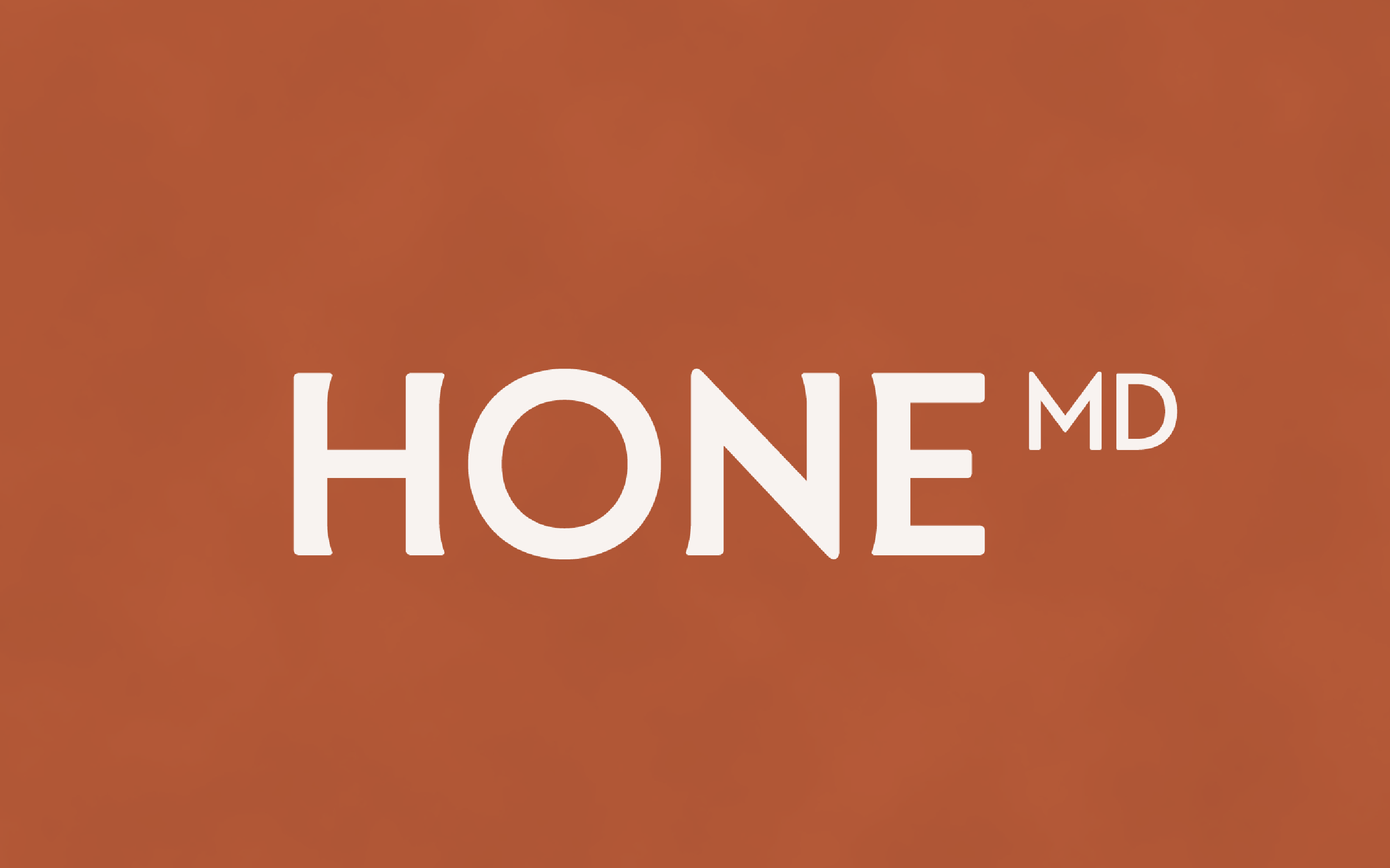
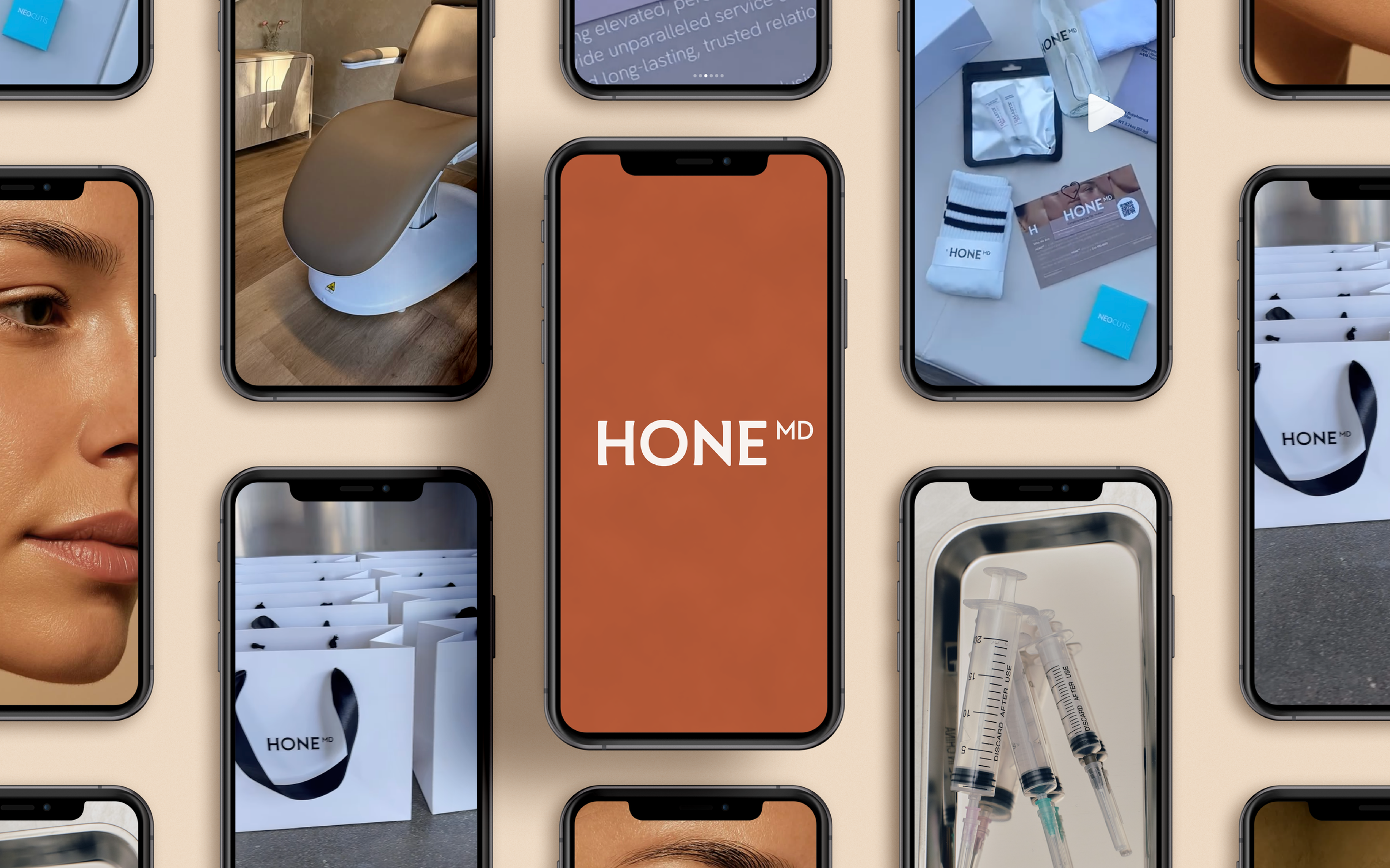
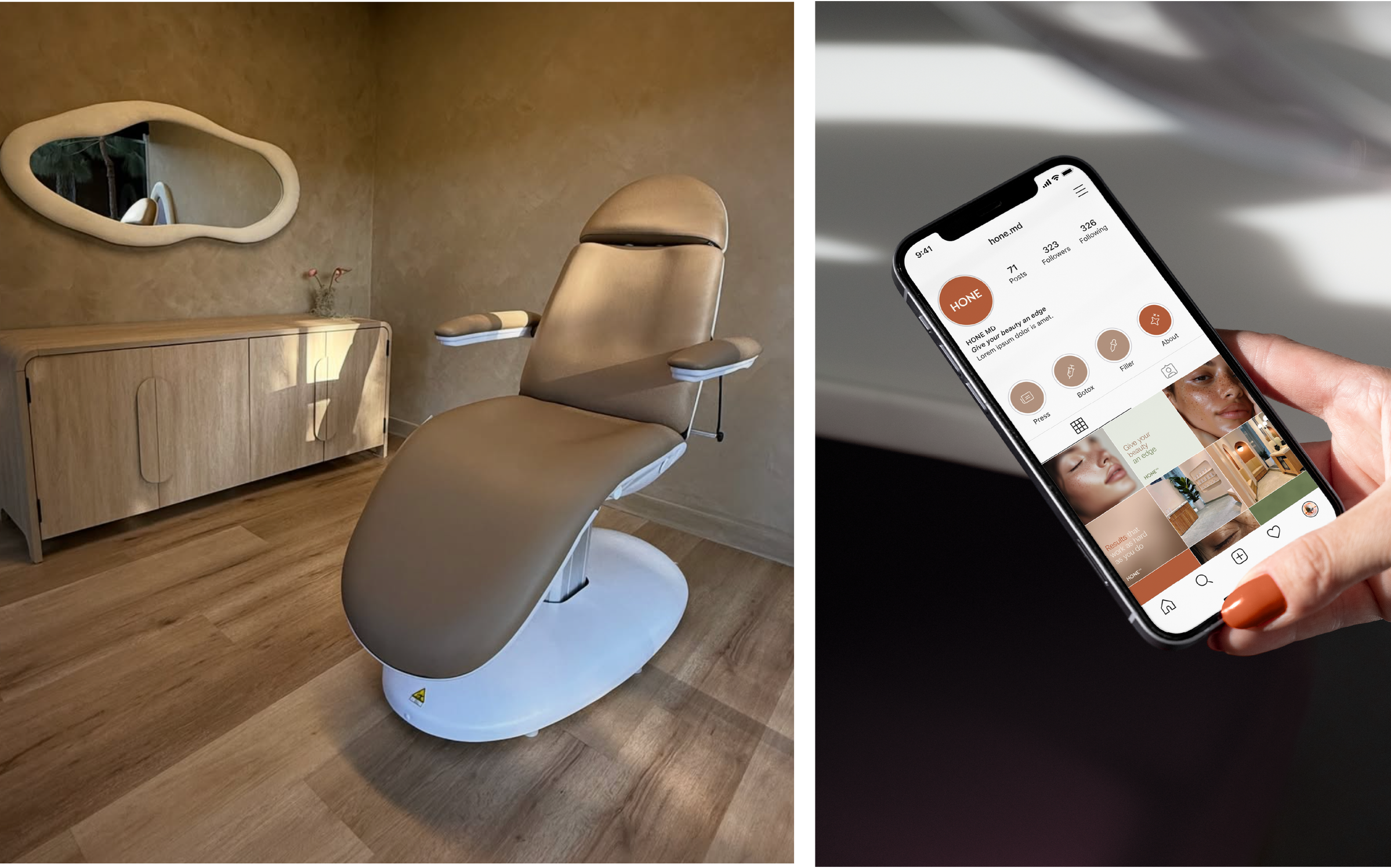
BRAND IDENTITY
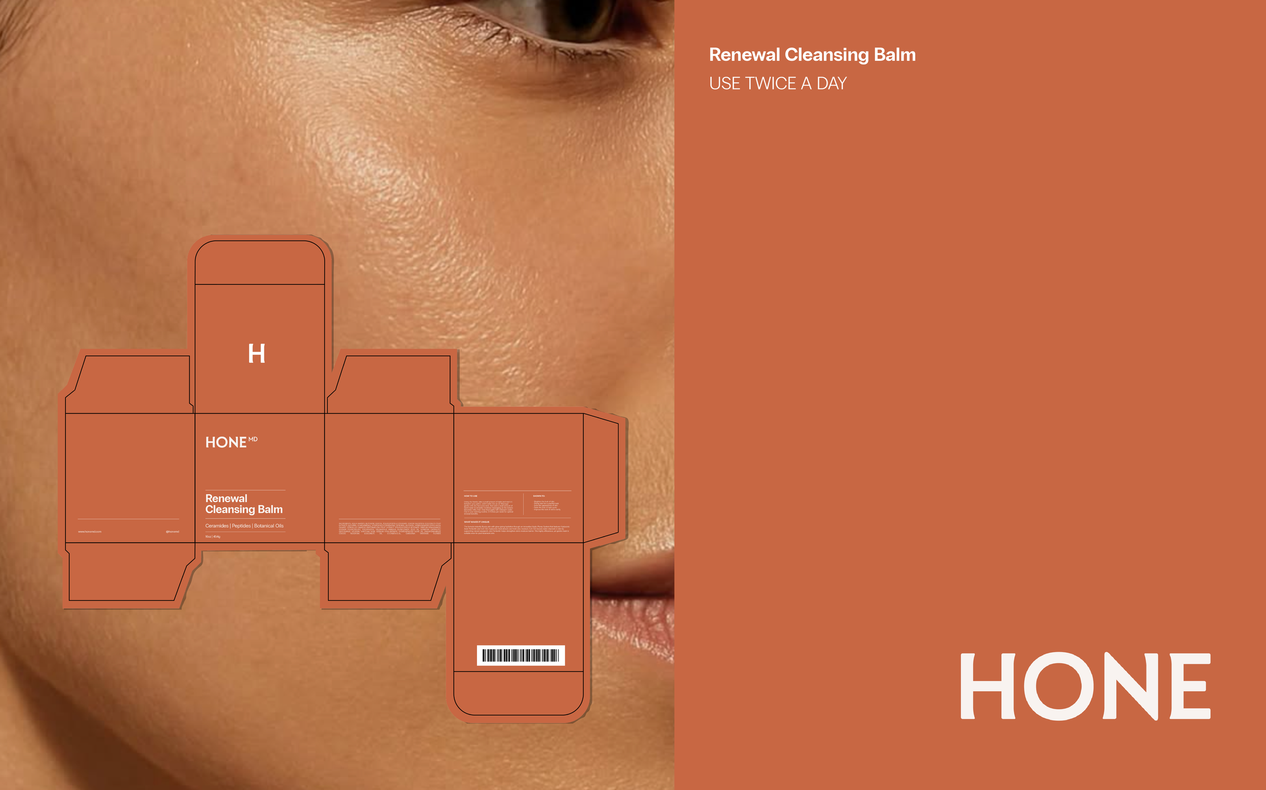
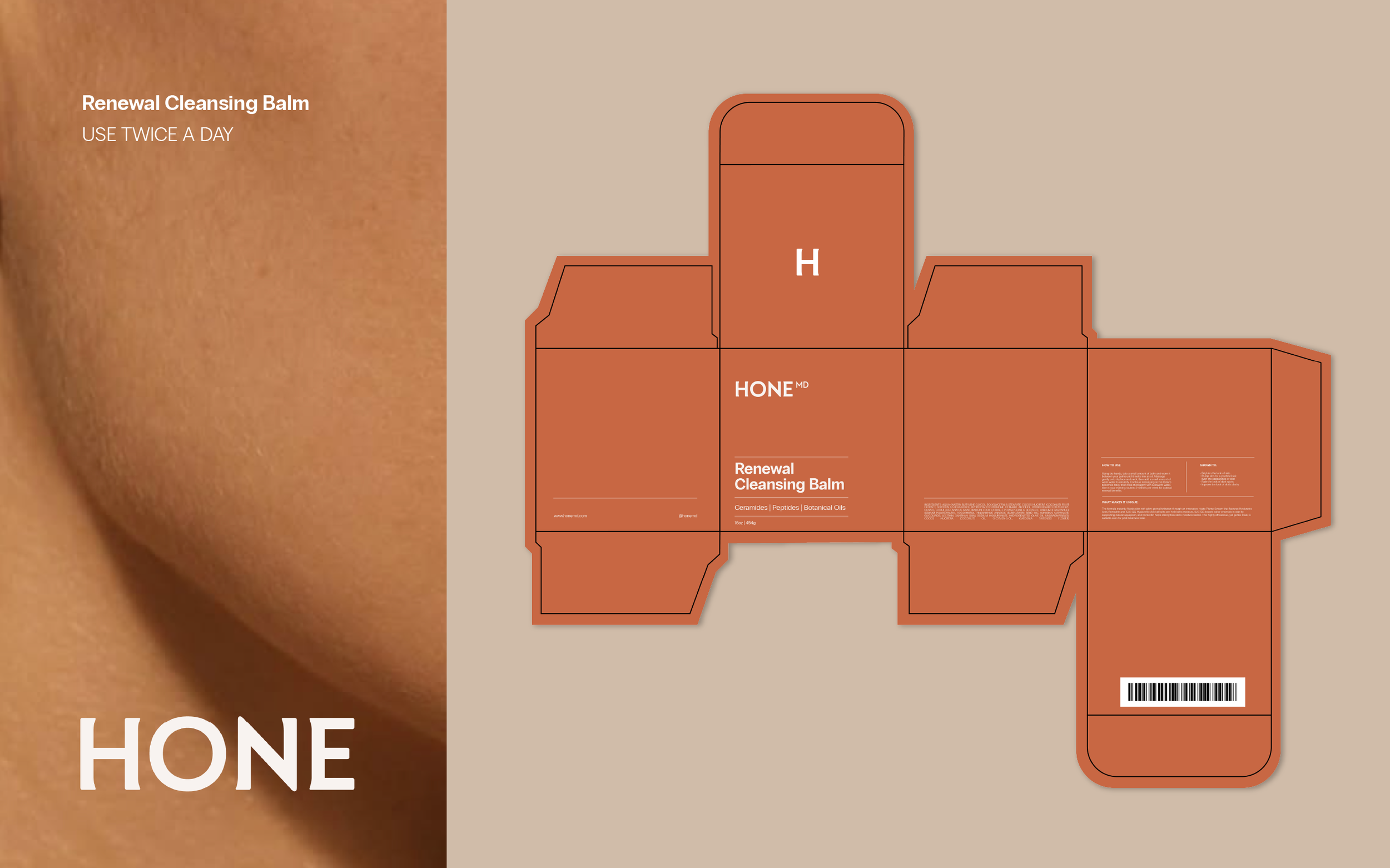
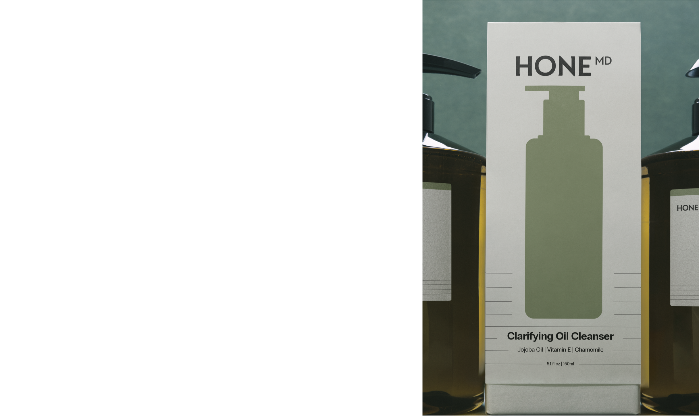
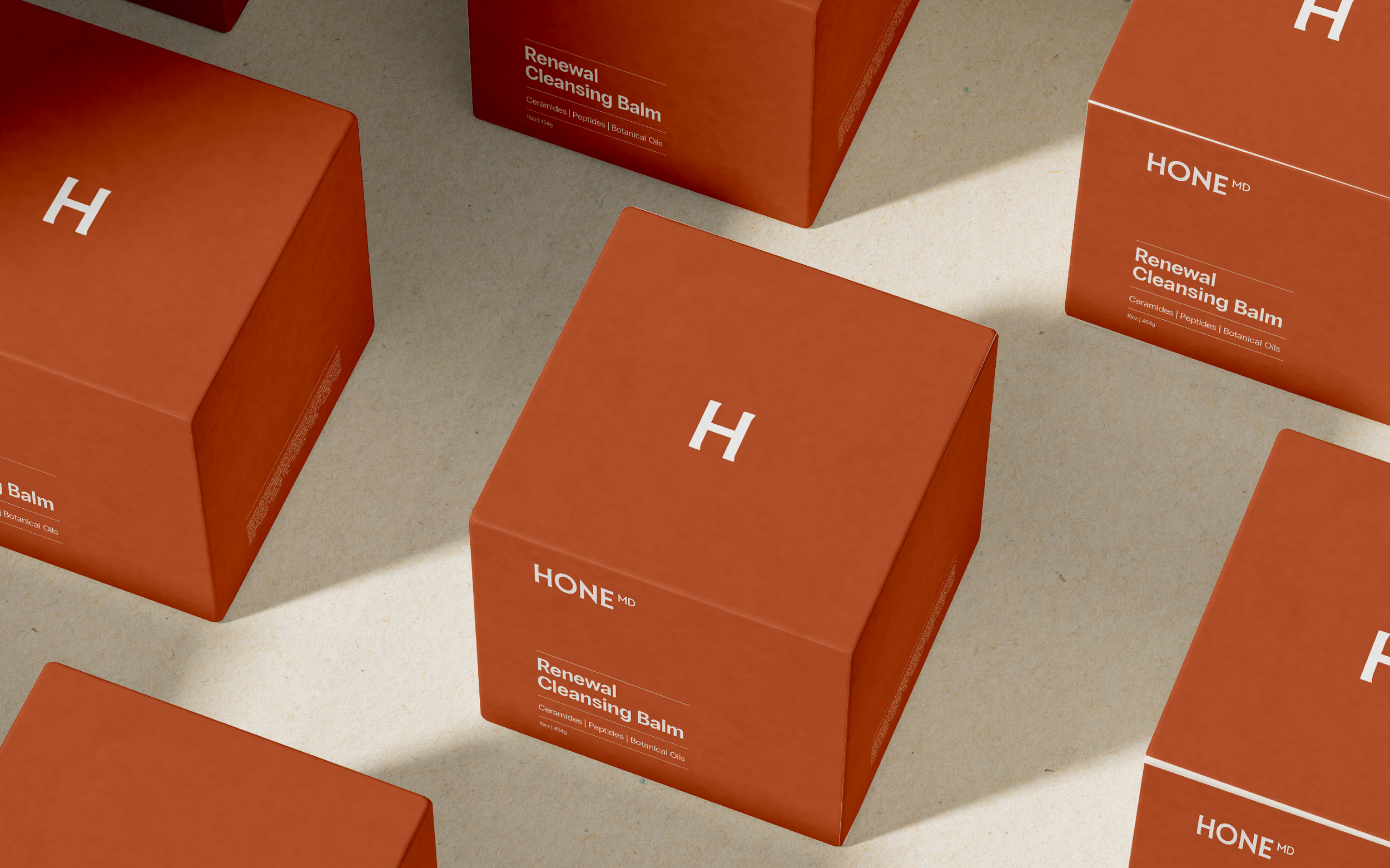
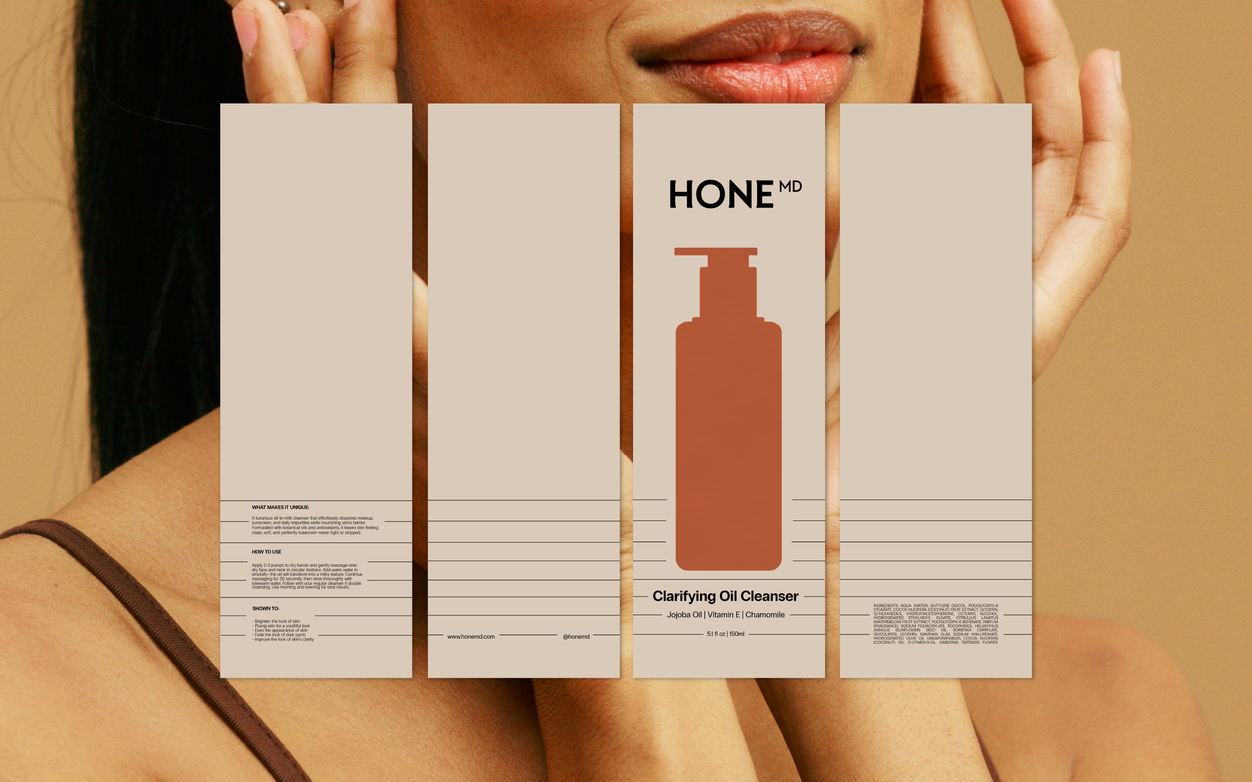
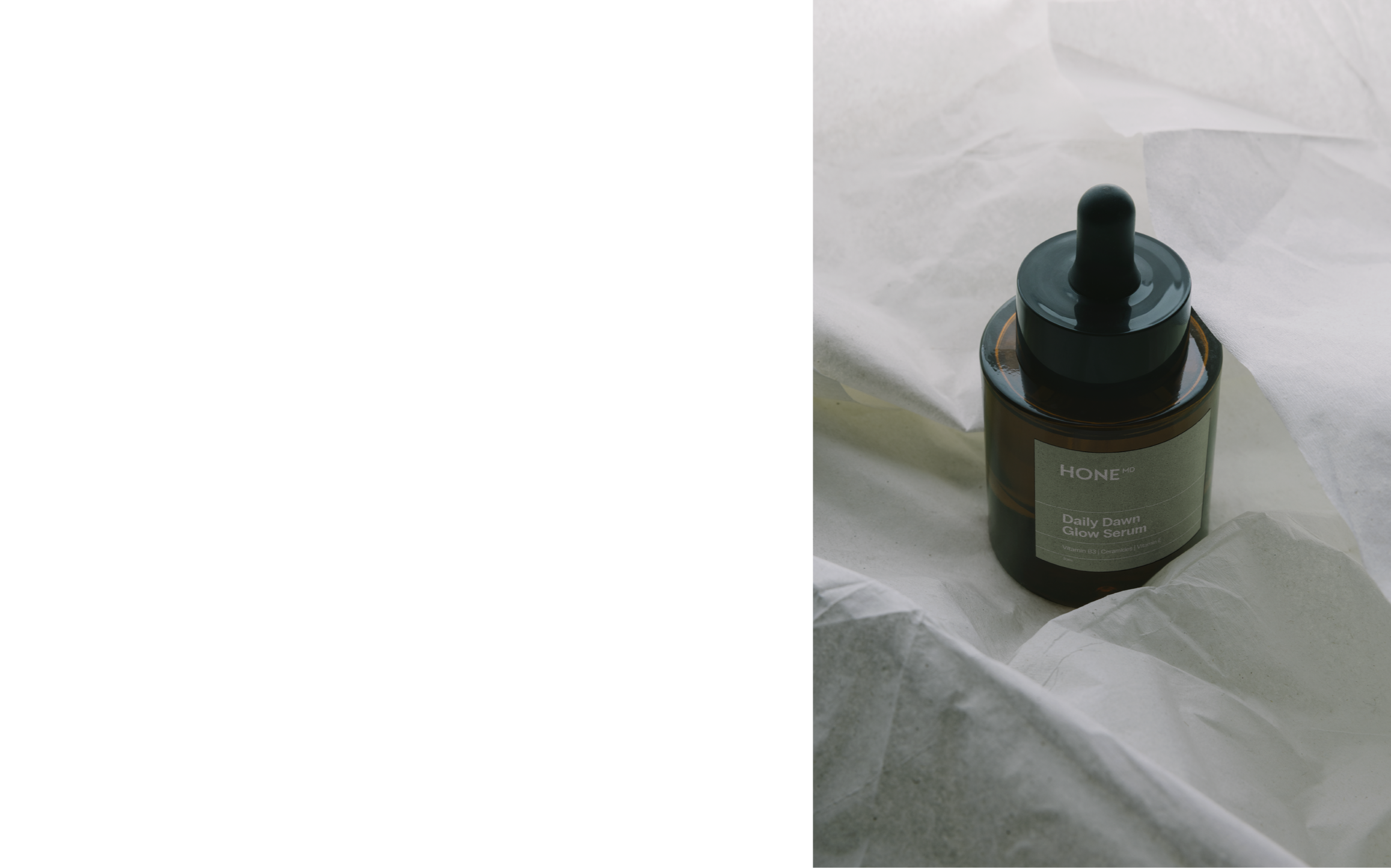
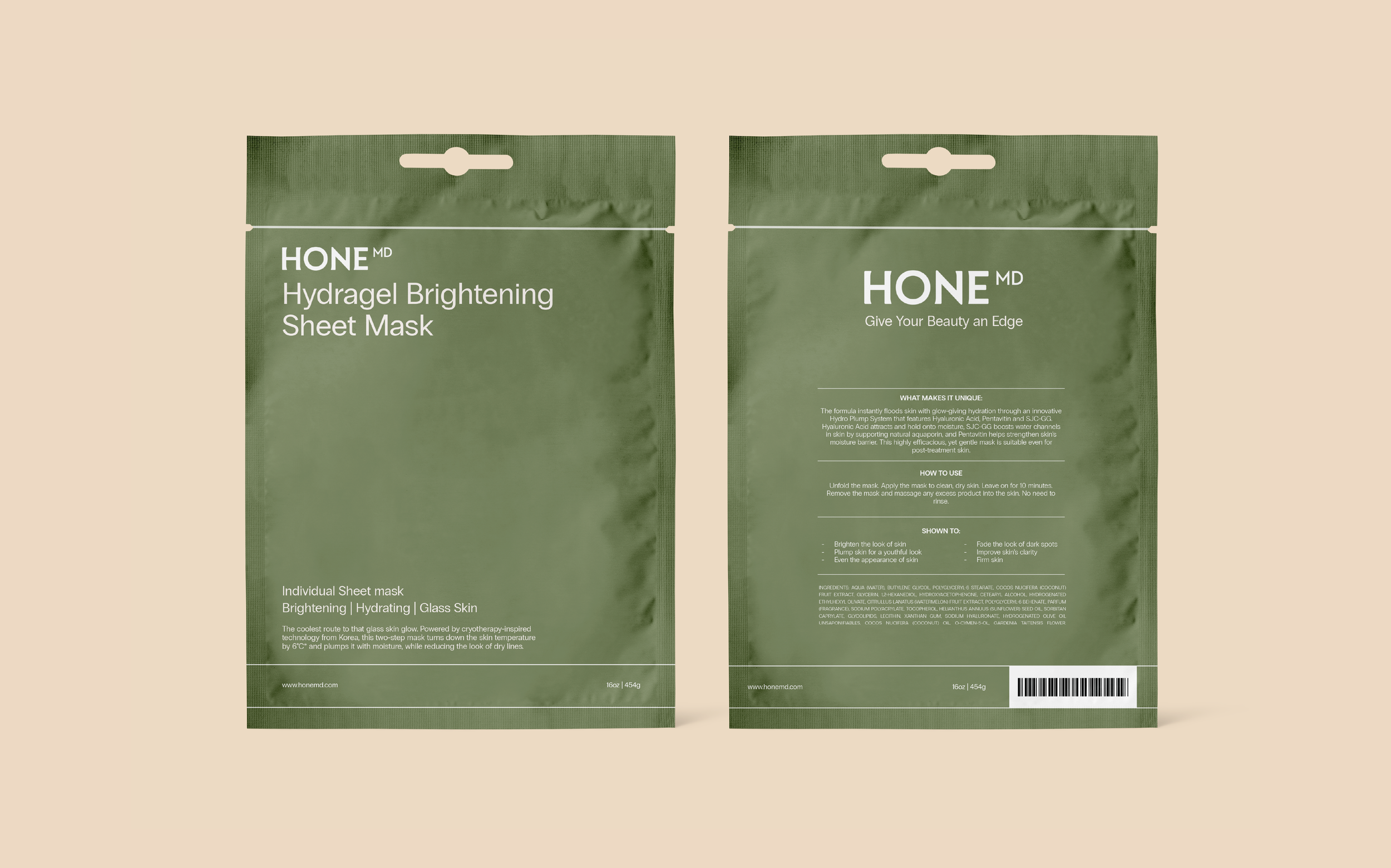
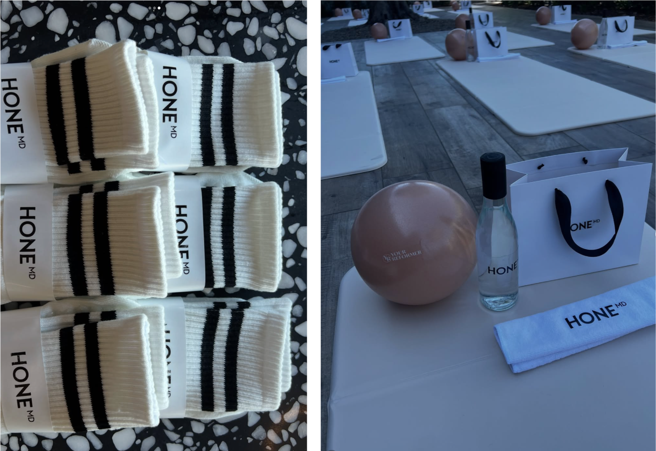
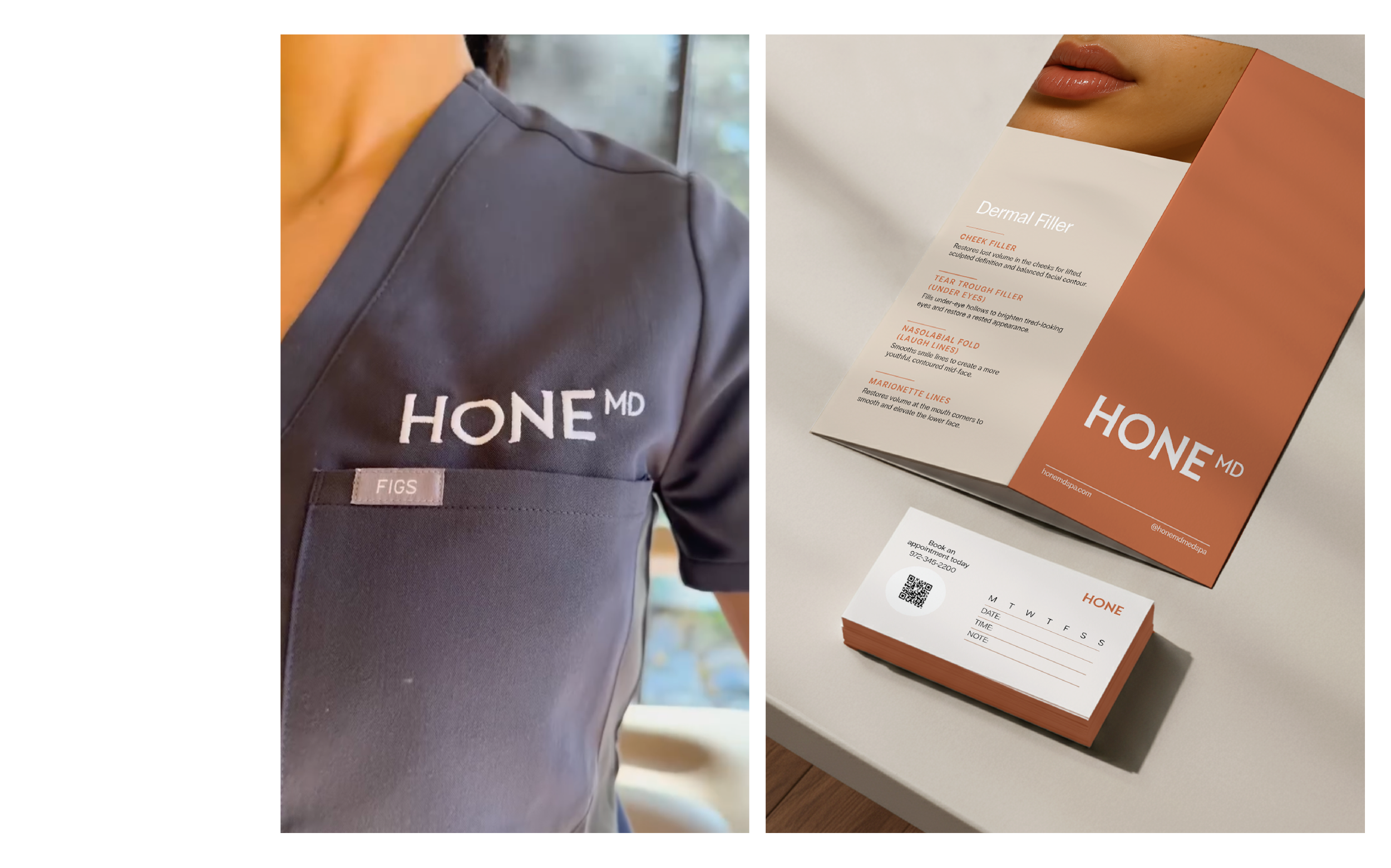
PACKAGING
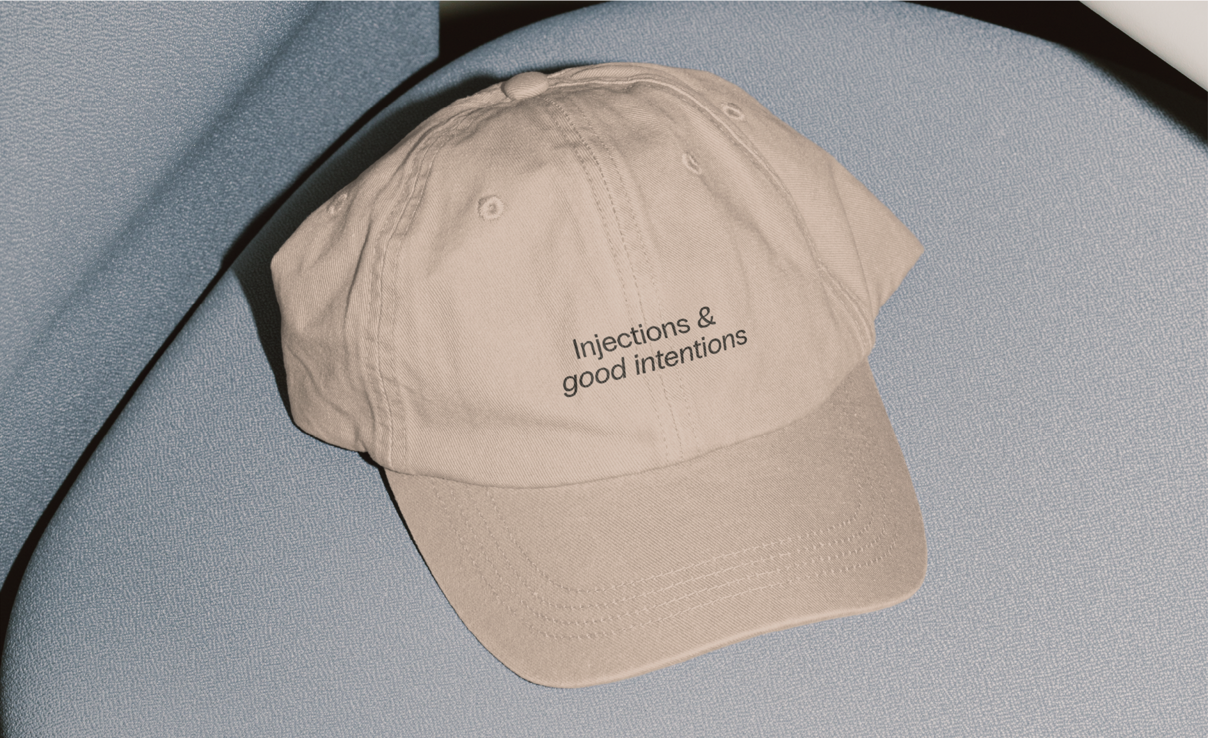
DIGITAL & PRINT COLLATERAL
SOCIAL MEDIA
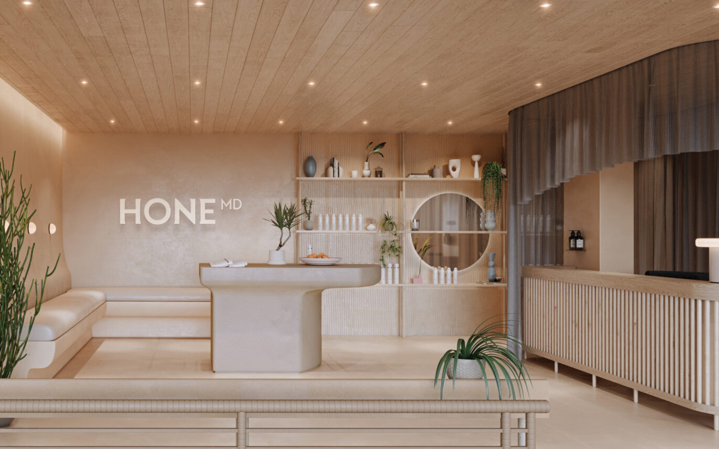
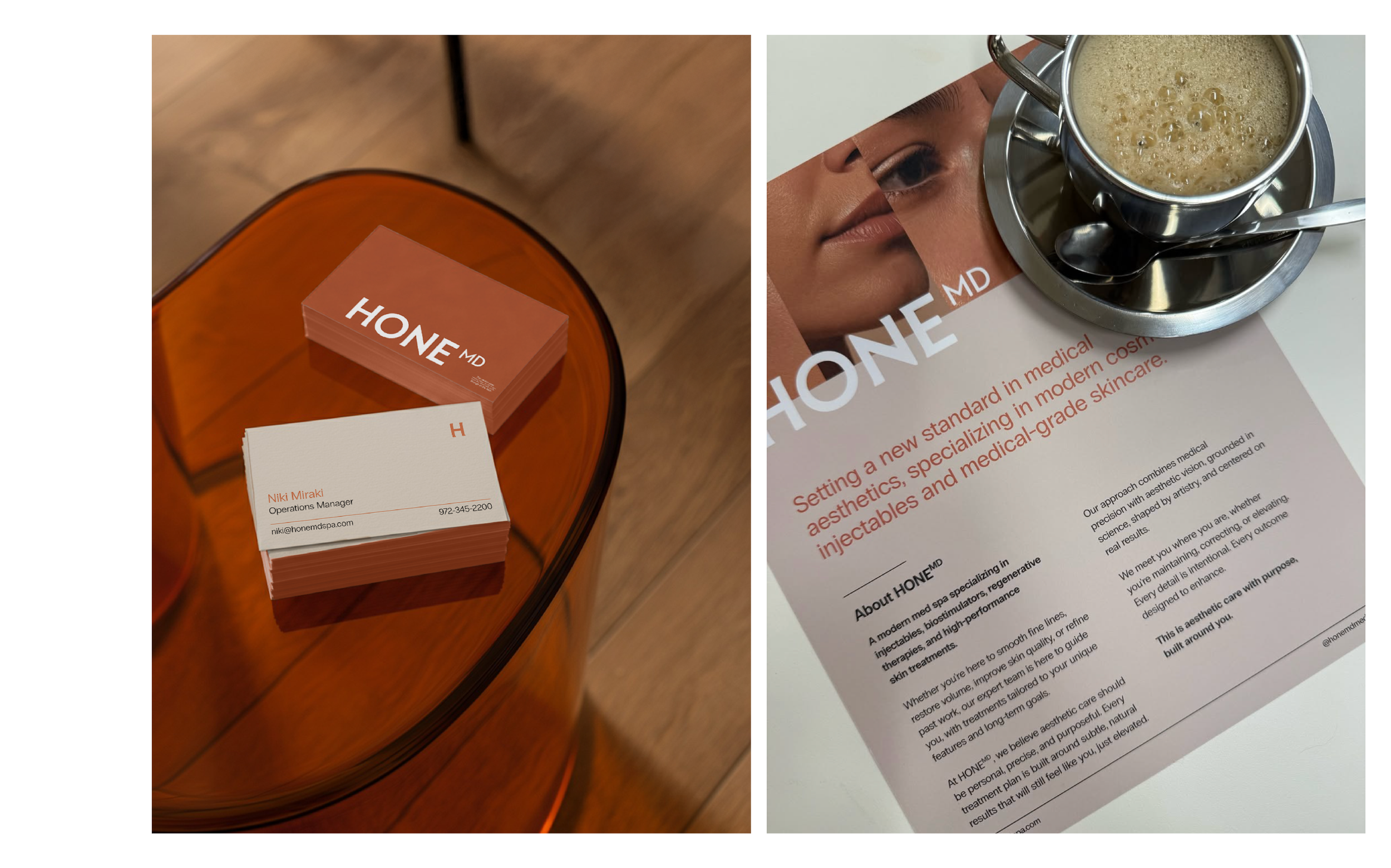
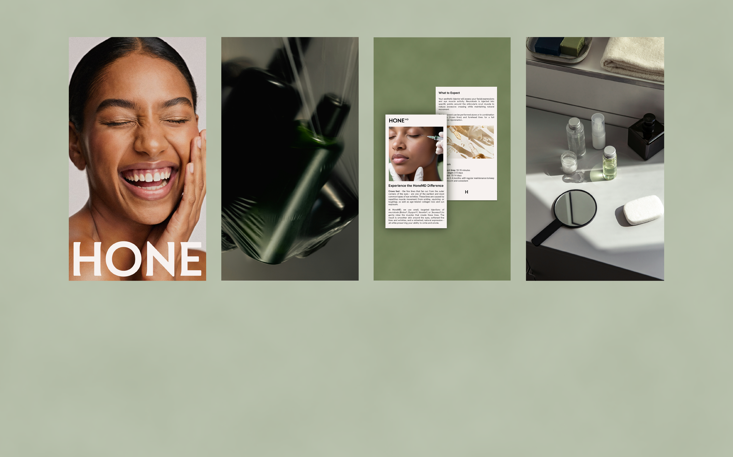
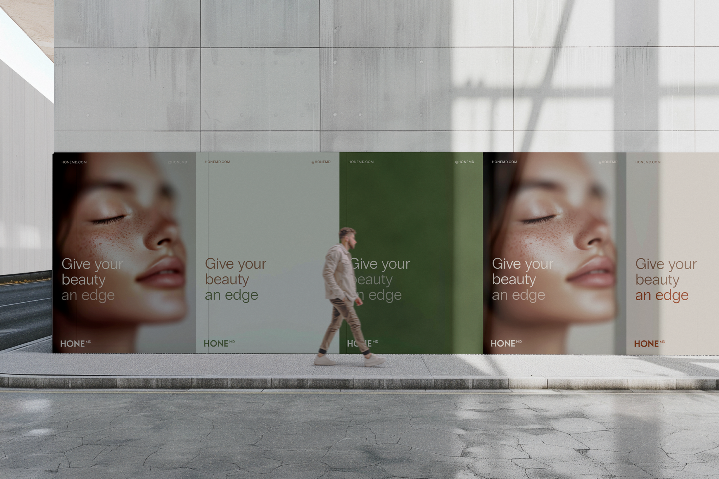
So how do you build trust without relying on the same tired visual cues every other med spa uses? Warm tones combined with a range of neutrals. A custom wordmark with actual personality. A brand that says we know what we're doing without also saying and you can't afford it.
We looked at what the competitors were doing and did the opposite of blending in. Everything from the colour palette to the typography was chosen to feel premium but approachable. Because when your audience is women Googling injectables for the first time, the last thing they need is a brand that feels like it's judging them at the door.
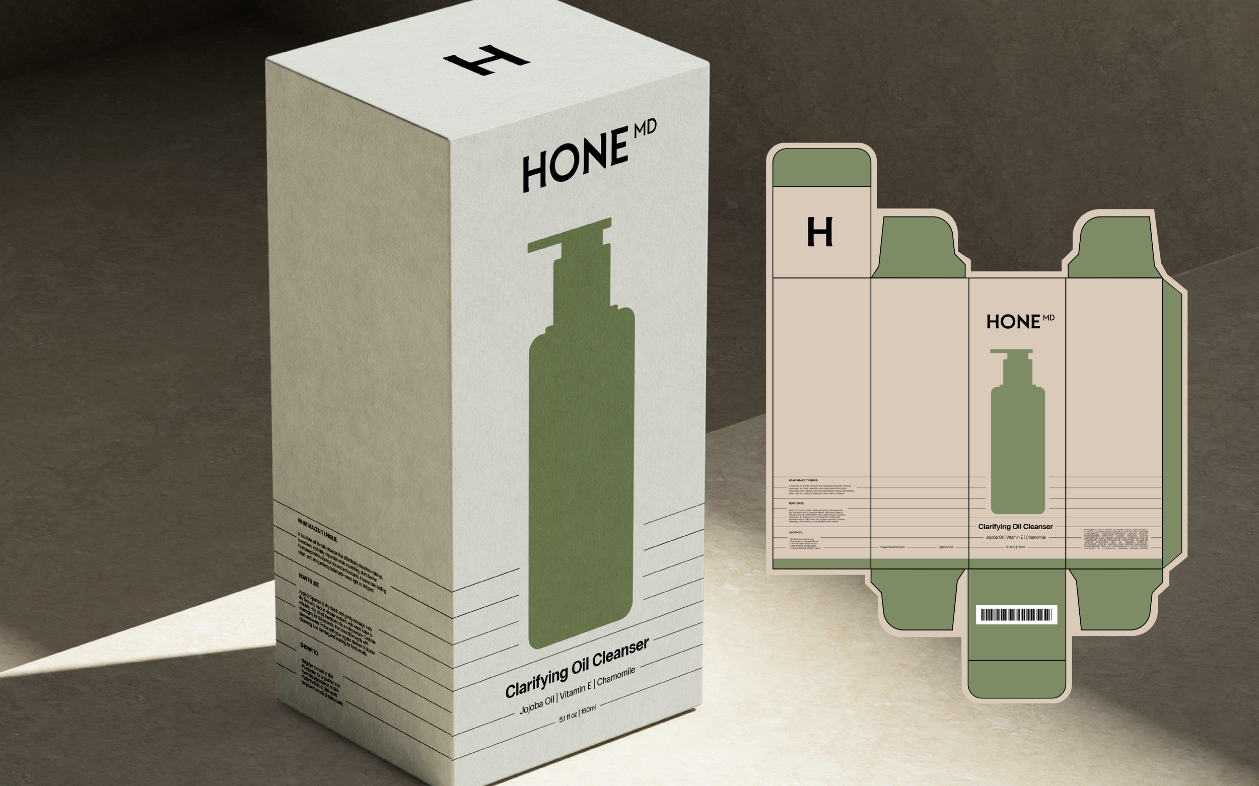
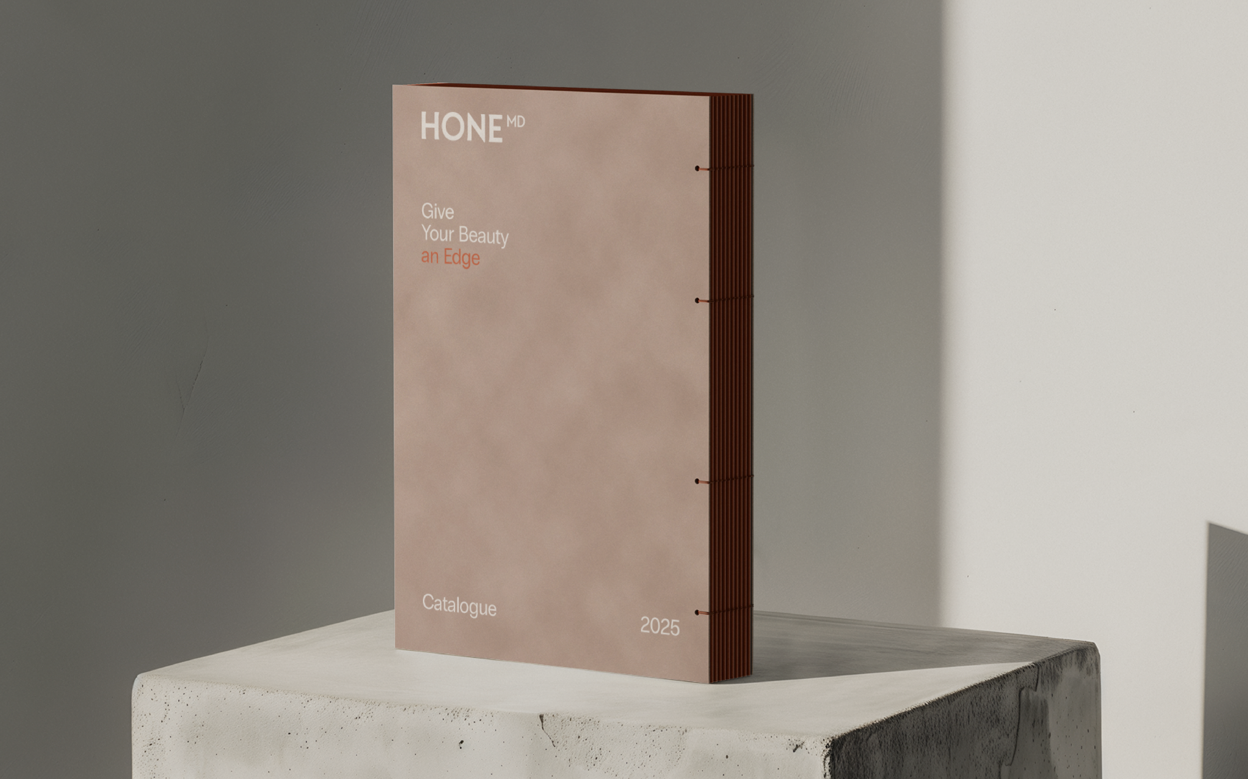
We created the full brand identity, all marketing touchpoints and future packaging. From business cards to social media templates to packaging concepts, every piece was designed to feel like it belongs to the same world. It was an absolute honour to work on this one.
And not a single lotus flower in sight ;)
CLIENT: HONEMD
LOCATION: LOS ANGELES, CALIFORNIA & MORE LOCATIONS COMING SOON
SCOPE: BRAND IDENTITY, PACKAGING, MARKETING MATERIALS
See more of our work
〰️
See more of our work 〰️
CLIENT: HONEMD
LOCATION: LOS ANGELES, CALIFORNIA & MORE LOCATIONS COMING SOON
SCOPE: BRAND IDENTITY, PACKAGING, MARKETING MATERIALS